- Open Doors
- Posts
- Designing Your Portfolio in 2025: A Comprehensive Guide 🧑💻
Designing Your Portfolio in 2025: A Comprehensive Guide 🧑💻
Everything you need to structure, shape, and sharpen a standout portfolio in 2025

Together with
Hey and welcome back to another week! 👋
I ran a poll in last weeks issue asking you what type of content you’d love to see more of and the clear winner is: the portfolio! Hence I decided to bring you a comprehensive guide on how to structure and craft your portfolio over the next two weeks. This week we are starting with your portfolio in general before I’m going to go deep on case studies next week.
In this issue:
What Makes A Portfolio Work in 2025: Find out in today’s article walking you through the essential bits.
The Best Portfolio Course Out There: If my article today isn’t enough and you need the full walkthrough, Aneta’s course got you! Make sure to claim a hefty discount too!
Anastasia’s Portfolio: If you want to work on consumer-facing apps the bar is high—Anastasia shows how it’s done.
🤝 TODAY’S PARTNER
Turn your junior projects into a strong UX portfolio
A portfolio is a must-have for hands-on designers, especially for junior designers who lack experience. Your portfolio serves as proof that you can do the design job.
To build a great UX portfolio, you need skills like a growth mindset, storytelling, visual storytelling, visual design, and more. And that’s exactly what the UX Portfolio Course offers.
What you'll get:
Understand hiring managers' perspectives
Access 481 portfolio examples
Craft portfolio stories using storytelling tactics
Design high-quality visuals with 48+ Figma templates
Special offer: Open Doors readers get 50% OFF until August 31st
Use this code at checkout: OPENDOORS50
Designing Your Portfolio in 2025: A Comprehensive Guide 🧑💻
One of the most overlooked truths about design portfolios is this: it’s not just about the work. It’s about how the work comes together to tell a story — your story. If you’re treating your portfolio as a list of projects or a visual archive, you’re missing the chance to stand out in one of the most competitive job markets design has ever seen.
And yes, it is competitive. Especially at early-career levels, you’re often not just competing with other juniors — you’re competing with designers who already have some experience under their belt, people who are already halfway to mid-level. In that kind of landscape, it’s not enough to just show good work. You have to frame it. You have to make people care. You have to make them remember you.
This guide is here to help you do exactly that — to zoom out and look at your portfolio not just as a showcase of deliverables, but as a whole platform, a layered piece of storytelling. We’re going to walk through the core parts of a strong portfolio — not from a place of arbitrary rules, but from the lived reality of how portfolios are evaluated today, and how you can actually shift the odds in your favor.
But before we get into the actual structure… let’s talk tools.
This isn’t an article about which portfolio tool to choose — but let me make one thing very clear: don’t use Behance or Notion. I know they’re convenient, and if it were just up to me, I wouldn’t care that much. But the reality is: many hiring managers and recruiters will bounce immediately. These tools create a perception of being unfinished, uninvested, or not “serious” enough, especially in a competitive market.
What you choose beyond that is up to you — you can vibe code it (I gave an intro to that hereand even posted a Lovable template here), use one of the visual builders like Framer, which I personally recommend (and am using myself right now).
The only requirement? It needs to give you the flexibility to apply the structure and strategy you’re about to read in this article. You want your portfolio to feel considered, custom, and polished — not like you were boxed in by a rigid platform or template.
1. Hero Section — The Most Underrated Real Estate
The hero section is criminally underutilized. Most people don’t know what to do with it. So they fill it with a big job title, a floating illustration, or a string of buzzwords. But that space — that first scroll — is prime storytelling territory. It’s your intro, in the truest sense. And yet it’s often treated like filler.
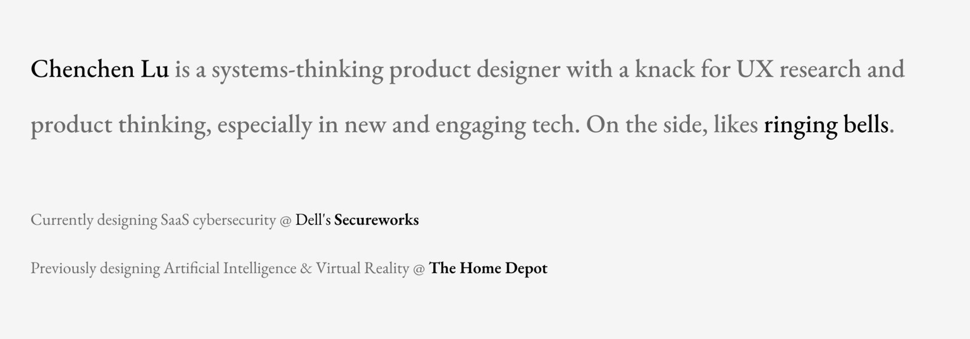
I keep coming back to Chenchen’s intro on a regular basis—it’s just so well written
Here’s the thing: your portfolio isn’t just a sequence of case studies. It’s a layered story. One layer is made up of the actual work you did — the projects, the deliverables, the impact. But zoom out, and there’s another layer that wraps around all of that: the story of who you are as a designer. That layer needs a beginning. The hero is where it starts.
Think about it like the first chapter of a book. A bad one might not stop someone from reading — but a good one? It pulls you in. And in the hiring process, where most portfolios are skimmed rather than studied, a good hero section can be the thing that makes someone stop scrolling and pay attention.
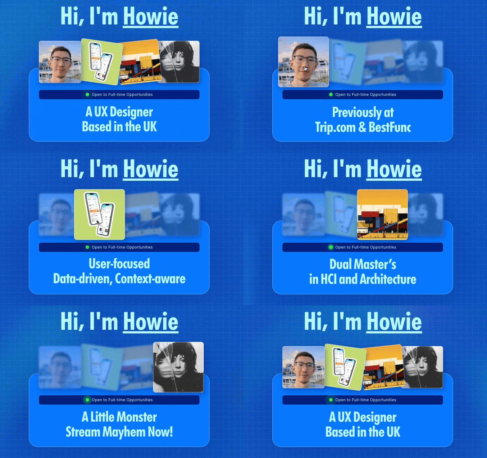
Howie shows how it’s done with interactions
So what belongs here? There’s no strict template, but you want:
A short, well-written intro (2–3 lines max)
A clear, confident statement of what kind of designer you are (Product Designer, Visual Designer, etc.)
A highlight of the 2–3 strengths that define your work — ideally ones that are reflected in your case studies
Optional: subtle motion, creative framing, or even a short video snippet, if it adds to the story
Don’t overthink the format — think about the function. You’re setting the tone for everything that follows.
2. Work Preview Section — Not Just a Grid
This is where you show your work — not tell. But that doesn’t mean dumping a bunch of thumbnails on a grid and calling it a day. This section deserves more care.
Too many people default to a 3x3 or 4x4 grid of static previews, with generic project titles like “Company App Redesign.” That tells me nothing. Instead, go for:
Impact-forward titles. Instead of “Spotify Concept,” write: “Rethinking Spotify onboarding to reduce user churn.”
Visuals that reward a closer look. Show a screen that actually demonstrates the quality of your design work. Don’t cram in 4 tiny thumbnails per project. One focused, zoomed-in frame is far more convincing.
Motion or interactions, where it fits. Whether it’s a subtle hover effect, a looping gif on hover, or an interactive state — show that you care about the craft and experience.
Metadata only if it adds context. Year, role, type of work — include only if it helps clarify the project or shows breadth. Don’t clutter.
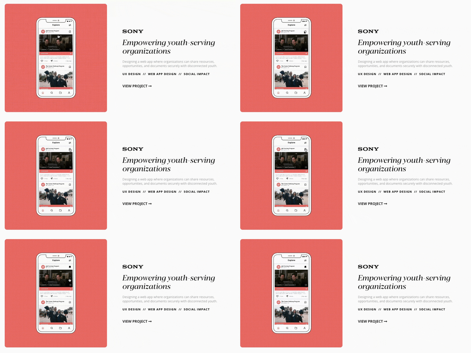
Totally fine to use a simple and proven structure like Kaja did—but using motion and writing an enticing title is what makes the difference
Ultimately, this section’s job is to hook people into your case studies. So treat it like a teaser — make it visual, focused, and inviting.
3. About Me — The Snapshot They’ll Remember
“No one hires you for your hobbies.” True. But also: no one hires you purely for your output either. Culture fit exists. Personality matters. And this section is your opportunity to show just a hint of who you are beyond the designer.
The About Me section gives people a sense of the person behind the pixels. This doesn’t mean a long story or a laundry list of hobbies — it means a short, thoughtful paragraph or two that adds texture. Think:
What drives you as a designer?
What inspires you?
What do you love doing outside of design that might make someone smile or remember you?
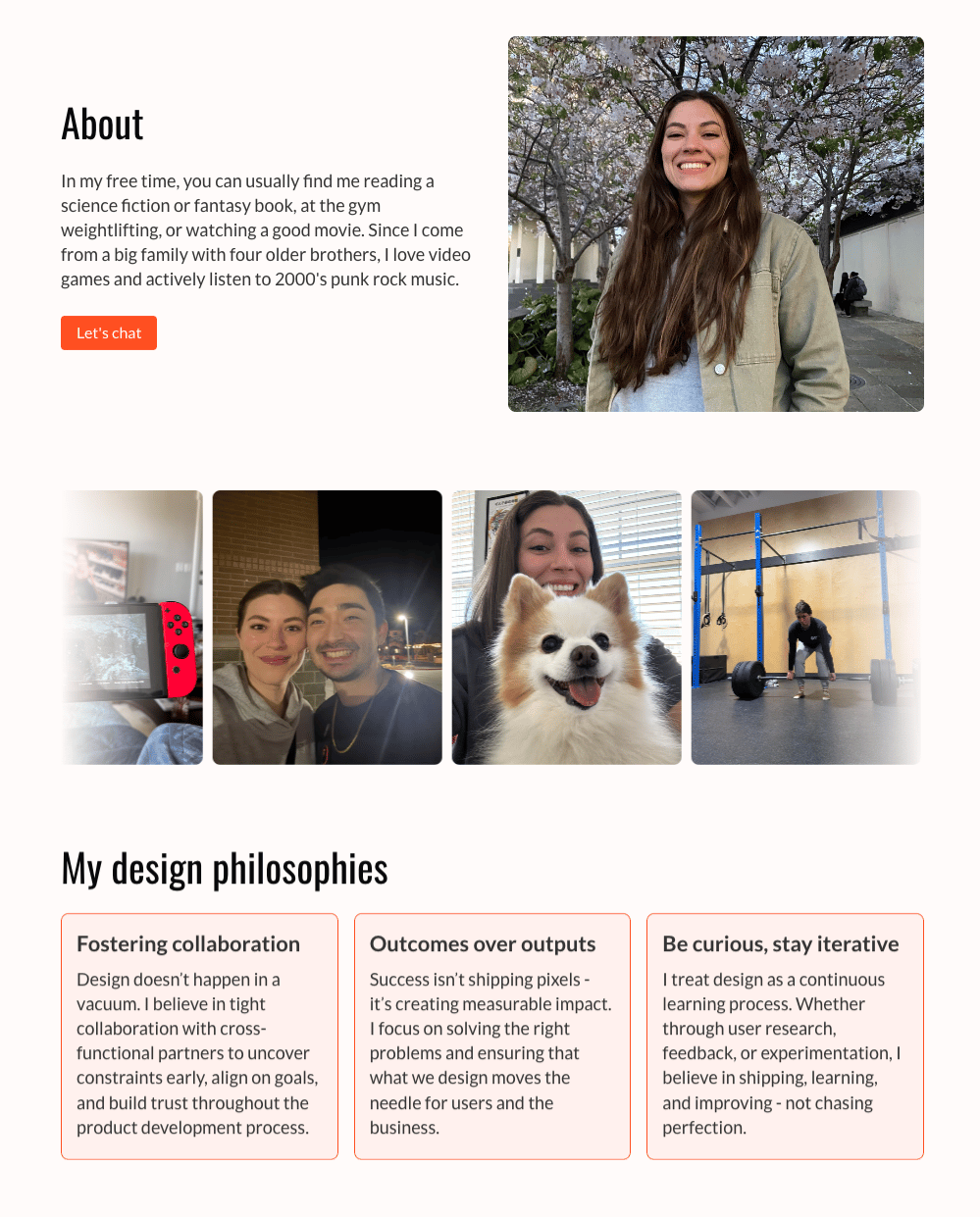
Samantha blends personality and a bit of design-related bits perfectly
Where to put it?
On your homepage as a small section under your work (great if it’s concise)
Or on a separate page (if you want to go deeper)
Either way, don’t overexplain. And don’t repeat what you already said in your intro or your resume. Think of this as an opportunity to make your portfolio a little more human.
4. Playground — Bonus Points (If Done Right)
The Playground (or “Fun Projects” or “Experiments” section) is not essential — but when done well, it adds a lot. It’s where you can show off work that doesn’t warrant a full case study, but still says something about your skills, interests, or curiosity.
Think:
Motion design experiments
Visual explorations or concept work
Tiny side projects or prototypes
Anything that showcases range or depth beyond your core portfolio
The key? Keep it clearly separate from your main work. This is additive, not foundational. It should never compete with or distract from your actual case studies.
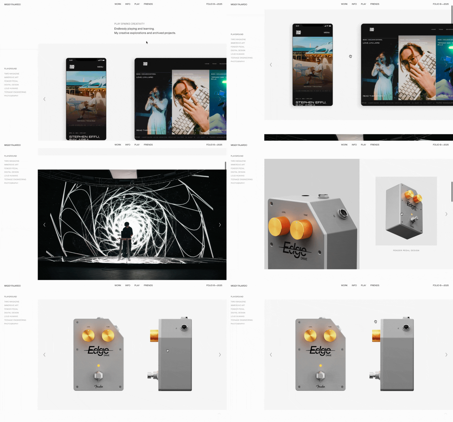
Miggy has one of the best playgrounds (and portfolios) I’ve seen in quite a while
Place it toward the end of your site, or tuck it away on its own page. Make it feel light, exploratory, and above all, optional. It’s there for the curious — not the skim-readers.
A good portfolio isn’t about maximizing the amount of content. It’s about making every part intentional. Think of it like designing a product — every screen, every scroll, every line of copy contributes to a cohesive experience. And in this case, you are the product.
Craft it like you would any experience: clearly, confidently, and with care.
Next up is talking about how you can write and design a top case study because that is really a topic of it’s own.
📂 ORGANIZE YOUR DESIGN WORK WITH AI
The Only AI That Knows All Your Work
Most AI tools start from scratch every time. ClickUp Brain already knows the answers.
It has full context of all your work—docs, tasks, chats, files, and more. No uploading. No explaining. No repetitive prompting.
It's not just another AI tool. It's the first AI that actually understands your workflow because it lives where your work happens.
Join 150,000+ teams and save 1 day per week.
👀 Portfolio Showcase
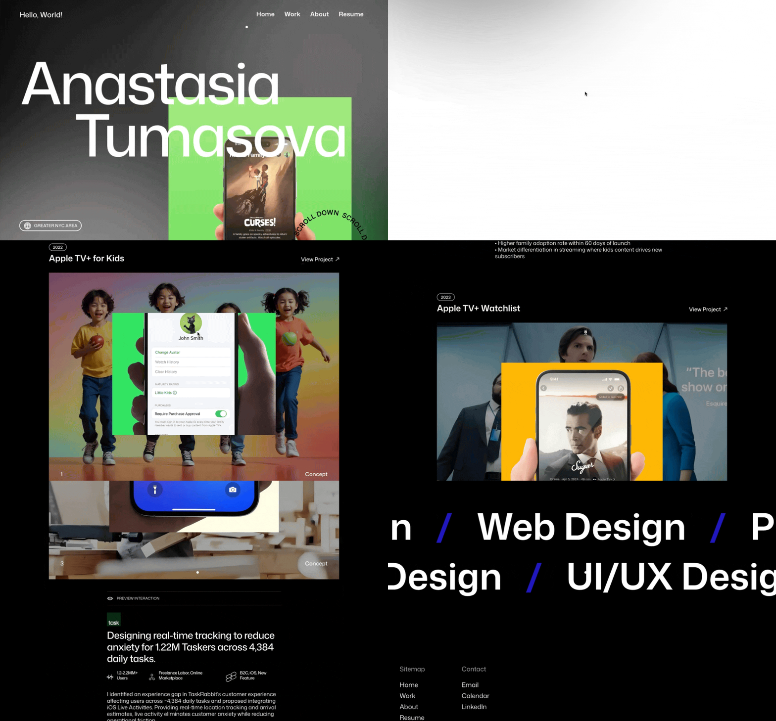
Today: Anastasia Tumasova
Anastasia Tomasova’s portfolio shows exactly how to carve out a niche in consumer-facing mobile design — even without real client work.
With a strong background in QA engineering and a clear eye for detail, Anastasia has built a portfolio that feels intentional, visually polished, and strategically focused. Her work is fictional for now, but it’s tailored with the kind of care and clarity that makes you take it seriously.
Let’s dive into what she’s doing well — and two ways to push this strong start even further.
That’s it for this week—thanks so much for the support! ♥️
If you’d like to support my efforts on Open Doors further you can buy me a coffee. If you ever got any value from my emails consider it so I can keep this newsletter free and available to everyone out there.
Do you want your own portfolio reviewed in-depth with a 30-minute advice-packed video review? Or do you require mentoring to figure out a proper strategy for your job search?
I got you!
Book a mentoring session with me
Book a quick 15 min chat to ask a question and see if we vibe
Keep kicking doors open and see you next week!
- Florian


