- Open Doors
- Posts
- Junior Portfolio Showcase: Anastasia Tumasova
Junior Portfolio Showcase: Anastasia Tumasova
Strong visual instincts, solid platform thinking, and a clear focus on consumer mobile — even without real-world projects

Today: Anastasia Tumasova
Anastasia Tumasova’s portfolio shows exactly how to carve out a niche in consumer-facing mobile design — even without real client work.
With a strong background in QA engineering and a clear eye for detail, Anastasia has built a portfolio that feels intentional, visually polished, and strategically focused. Her work is fictional for now, but it’s tailored with the kind of care and clarity that makes you take it seriously.
Let’s dive into what she’s doing well — and two ways to push this strong start even further.
The Good
Premium presentation that balances polish with purpose
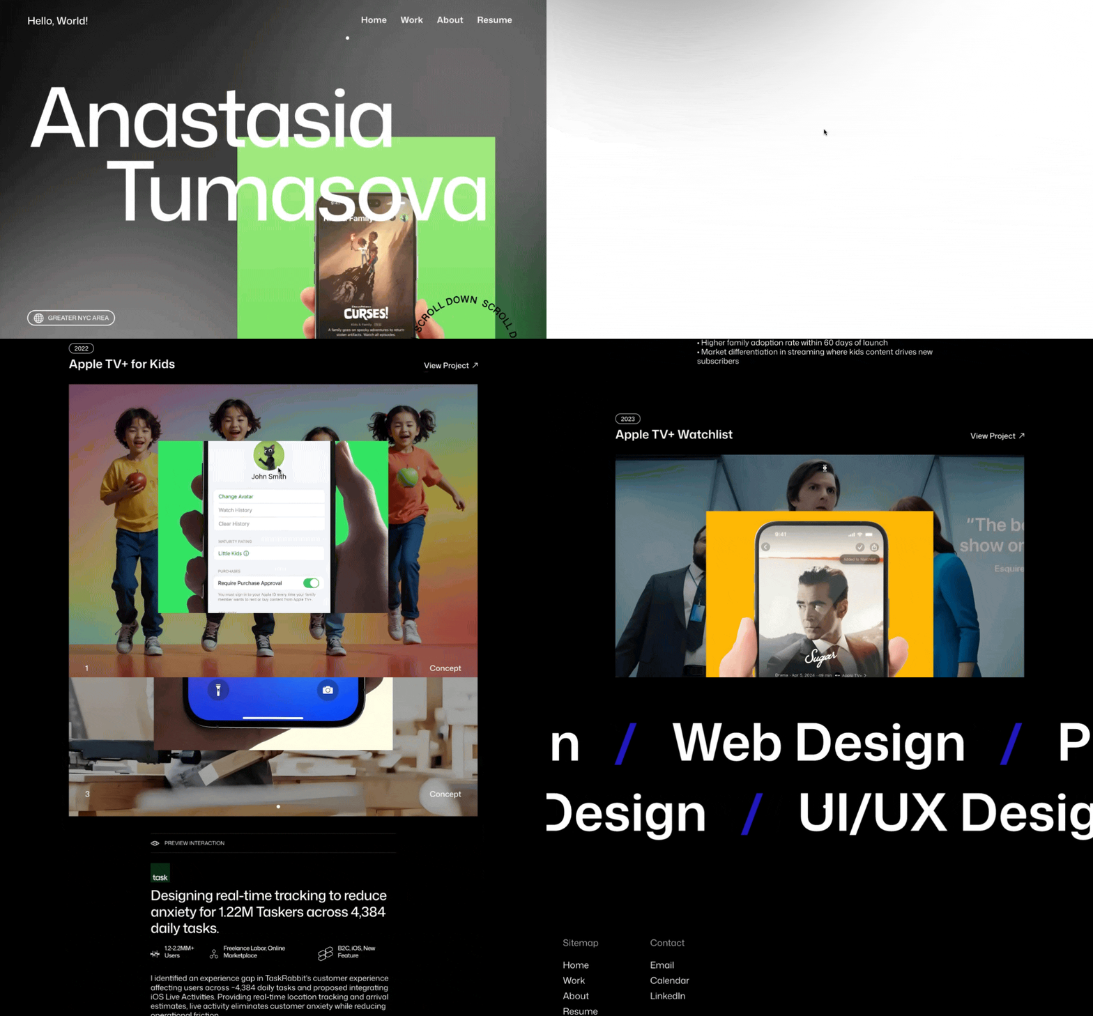
From the homepage alone, Anastasia’s visual instincts are clear. Her scroll animations are subtle, her typography is tight, and her visual hierarchy is crisp and considered. Even more importantly, she’s not just focused on aesthetics — she’s focused on impact.
Each project is presented with clear goals and a strong narrative. You’re not just looking at pretty screens — you’re seeing how those screens are meant to move the needle. And the way she uses interaction previews (like GIFs on hover) helps bring those ideas to life, without overwhelming the viewer.

The presentation feels premium and is a good match for the type of work
The result is a portfolio that reads as confident and high-quality — and that holds up on closer inspection.
Staying true to the ecosystem she’s designing for
Consumer-facing mobile design is competitive. It’s not enough to make something look good — it needs to feel like it belongs in the product it’s meant for.
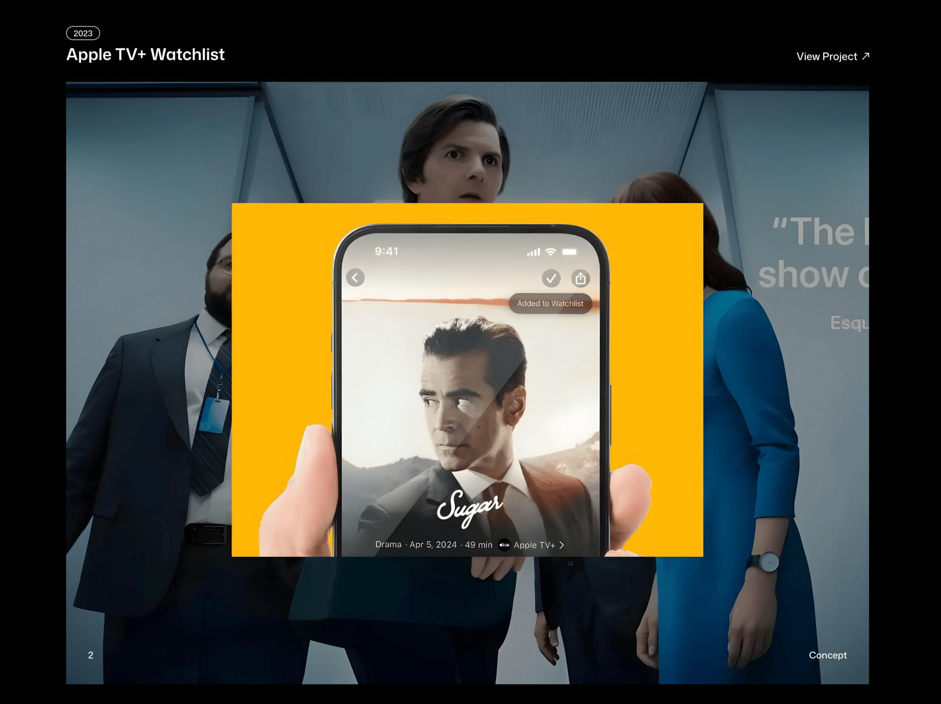
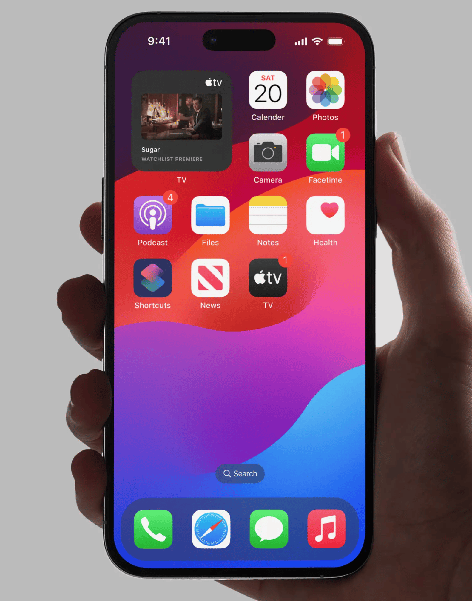
Anastasia does this remarkably well. Her Apple TV and TaskRabbit projects, for example, stick close to the design languages of their respective platforms — both visually and behaviorally. Her use of iOS conventions, from component styling to interaction patterns, shows that she’s not just guessing — she’s doing the work to match the ecosystem and speak the product’s native language.

Matching established products and brand guidelines is not an easy feat—and often done badly. Not here.
It’s the kind of detail that makes her portfolio stand out. And it’s a clear signal that she understands what it means to design within an existing system, not just on top of it.
The Potential
Polish your polish — and triple-check for visual consistency
Anastasia is clearly aiming high. And when you’re designing fictional projects for high-quality consumer apps, that means the bar for visual precision goes up.
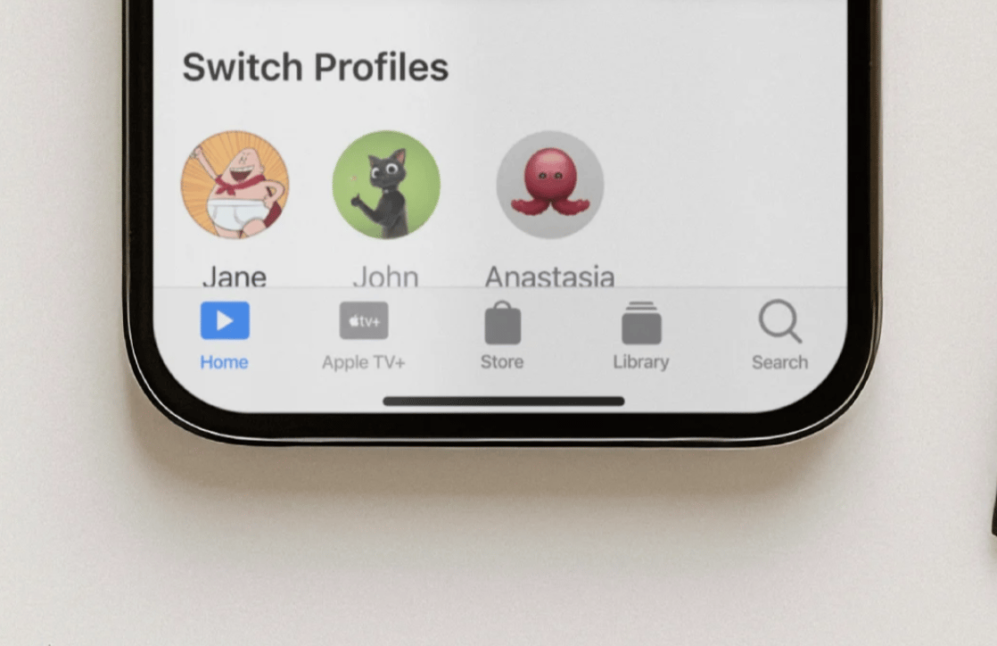
Most of her work is right on the mark. But there are still a few moments — small alignment slips, inconsistent states, color mismatches — where the attention to detail could be sharper. On the Apple TV Kids screen, for example, some inactive text states use different greys, and the icon spacing in the tab bar feels slightly off.

Can you spot it?
These are small things — but in this space, they matter. The closer your work gets to Apple-level fidelity, the more those details shape perception. And when you’re presenting fictional work, you want as little room for doubt as possible.
Dial back the business claims — and keep it grounded
One of the standout strengths in Anastasia’s work is her ability to think through business impact. She sets clear goals, outlines success metrics, and tries to show the potential value of her design decisions.
But in a few places, that confidence crosses into overstatement.
Framing a case study around a projected 40–50% adoption rate, or suggesting that Apple built a feature based on a similar idea 10 months later — while maybe well-intended — risks sounding a little too speculative, especially when the work is fictional.
The fix here is simple: keep the thinking, but adjust the tone. Show that you understand how to measure impact, not that you’re claiming direct causality. Acknowledge when something’s an assumption. And stay focused on what your design is aiming to improve — not what a company may or may not have done afterward.
Final Thoughts
Anastasia Tumasova’s portfolio is a great example of choosing a lane — and putting in the work to make it yours.
Her visual quality is strong. Her platform understanding is clear. And her ability to blend design instincts with business thinking gives her a serious edge, especially this early in her career.
With just a bit more visual diligence and slightly softer business framing, she’ll have a portfolio that’s not only sharp and compelling — but competitive at the highest levels.
Want to create an interaction-rich portfolio like Anastasia’s? Framer can do it!
Still struggling to get your portfolio off the ground?
Don’t want to spend weeks learning yet another tool? Framer is my top recommendation for building your portfolio — fast, clean, and without the usual headaches.
While in all honesty Anastasia’s portfolio was done with Webflow, Framer will let you achieve the same results and it will likely cost you a lot less time. Take it from someone who made the switch (it’s me).
If you’re just starting out (or even if you’re not), I think Framer is a perfect fit. Here’s why:
Flat learning curve: The interface feels familiar if you’ve used Figma — plus, there’s a plugin to bring your designs straight in.
Plenty of learning support: Framer Academy is packed with free tutorials, videos, and guides to help you go from zero to published.
A huge template library: Tons of high-quality (often free) templates in the marketplace to help you launch quickly without starting from scratch.
And that’s just scratching the surface. I wrote more about why I recommend Framer here—but honestly, the best way is to try it for yourself.
Affiliate disclaimer: I only recommend tools I personally believe in. Some links in this post are affiliate links, which means I may earn a small commission if you choose to purchase — at no extra cost to you.
How I can help YOU
Do you want your own portfolio reviewed in-depth with a 30-minute advice-packed video review? Or do you require mentoring to figure out a proper strategy for your job search?
I got you!
Book a mentoring session with me
Book a quick 15 min chat to ask a question and see if we vibe
Florian BoelterFlorian Boelter is a product designer, mentor and builder focussed on helping early-career designers navigate the job search and the first steps on the job. If my content helps you in any way I’d appreciate you sharing it on social media or forwarding it to your friends directly! |
