- Open Doors
- Posts
- Junior Portfolio Showcase: Uday Shankar
Junior Portfolio Showcase: Uday Shankar
Premium polish, thoughtful storytelling, and a portfolio that feels very senior.
Florian Bölter
March 18, 2026
Today: Uday Shankar
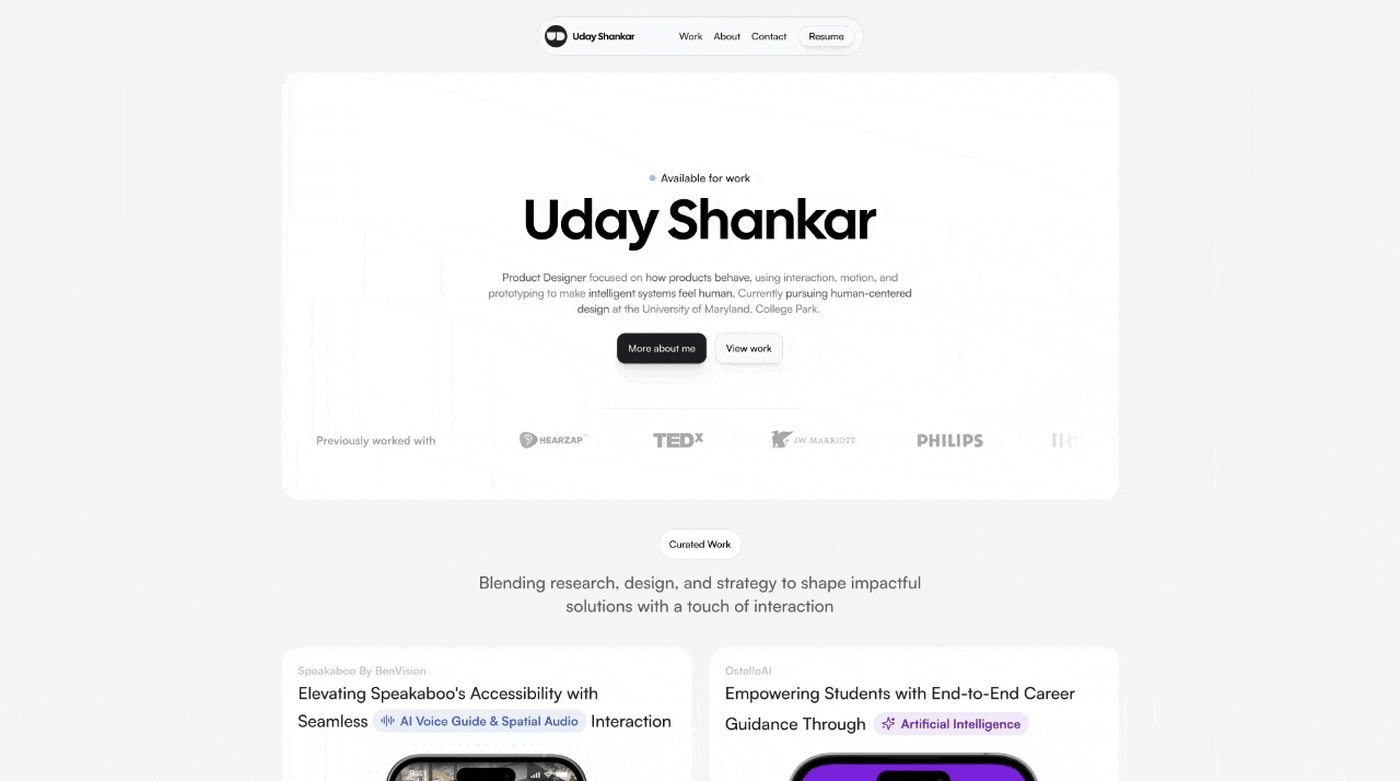
This week’s portfolio comes from Uday Shankar, a designer currently studying Human–Computer Interaction at the University of Maryland, College Park.
And the first thing that struck me when opening his portfolio was the overall feel of it.
It has that premium, almost boutique-studio aesthetic. The kind of visual tone you might expect from a well-known design agency or a polished product studio.
Interestingly, this is quite different from many junior portfolios we’ve looked at recently. A lot of them lean into playful visual styles — doodly illustrations, hand-drawn elements, experimental interactions.
Uday’s work goes in a very different direction.
It’s clean, controlled, and minimal, much closer to that Apple-like visual language that focuses on restraint and polish. And that style is actually much harder to execute well than it looks. When you remove visual noise, every small decision suddenly becomes visible.
But overall, Uday really pulls it off.
There are a couple of caveats we’ll discuss later, but this is undeniably a very strong portfolio with excellent craft and thoughtful project presentation.
Let’s break down what works particularly well.
The Good
A premium visual presentation that feels carefully crafted
The strongest first impression of Uday’s portfolio is simply how good it feels to interact with.
Everything looks intentional.
The project cards on the homepage are a great example. Each one has its own subtle character while still feeling cohesive as part of the same visual system. Hover states are understated but polished. The custom cursor adds personality without becoming distracting.
Another small detail I really enjoyed is how testimonials animate into view. As you scroll, the most important parts of the quotes get highlighted. It’s a tiny interaction, but it reinforces the sense that every piece of the interface has been considered.
The same attention to detail carries into the case studies themselves. Visual elements feel well curated and never redundant. Nothing feels like filler.
Even something as mundane as affinity mapping is presented thoughtfully. Instead of dumping screenshots or cluttered boards, Uday visualizes the process in a clean, digestible way that still communicates the underlying work.
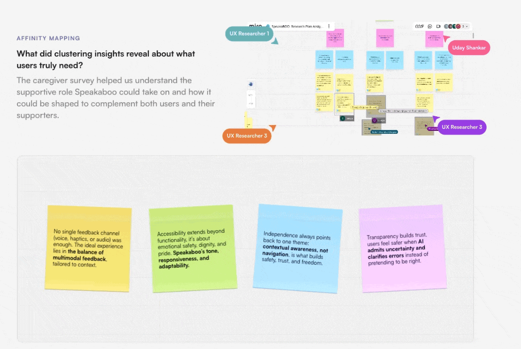
Not sure when I last genuinely enjoyed looking at affinity mapping
And then there’s the About page, which is almost a hidden gem.
It uses a bit of scrollytelling to walk through his story. This kind of presentation is common on marketing sites or agency pages, but seeing it executed well in a student portfolio is genuinely impressive.
It becomes a narrative about how he developed his craft over time and how that journey led to the work we now see in the portfolio.
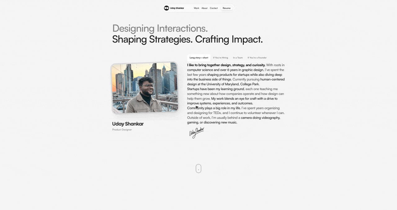
This is such a nice way of talking through your story
Overall, the visual polish here is excellent.
If someone asked me for an example of what clean, high-quality visual presentation looks like in a portfolio, Uday’s would definitely be one to study.
Storytelling that is thoughtful, curated, and well paced
Something that has become a recurring theme in the portfolios we’ve looked at recently is strong storytelling, and Uday’s work continues that trend.
But storytelling in portfolios can easily go wrong.
When designers try to do something novel — new layouts, new interactions, creative transitions — they sometimes end up making the case studies too long or too complicated.
That’s not happening here.
Despite the interactive elements and visual care, Uday’s case studies remain well curated and focused.
Each section feels deliberate.
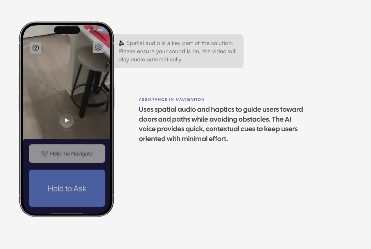
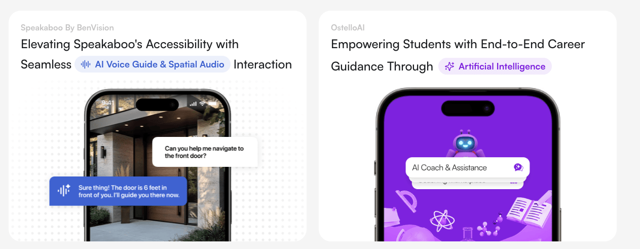
Take the Speakaboo case study, for example. When he describes the affinity mapping stage, he includes a subtle video showing collaborators interacting on a Miro board. The video itself isn’t the main point — the real takeaway is summarized clearly underneath with four well-designed sticky notes highlighting key insights.
That’s exactly the right balance.
You get a sense of the process without being forced to examine an entire research board.
What elevates moments like this even further is the way they’re presented. In the Miro example, the cursors are stylized with subtle hover effects that mimic design tools like Figma. It’s a small detail, but it adds a premium feel to the entire section.
This kind of treatment appears throughout the case studies.
Each section receives just enough visual support to make the narrative engaging, but never so much that it becomes overwhelming.
These feel a little bit unassuming but the way he incorporated them and also made sure attention is given to sound is very well done
Some sections are interaction-heavy, others rely more on strong visuals or simple structure. And importantly, each case study feels tailored to the project it’s telling, rather than following a rigid template.
That level of care is not easy to achieve.
And when it works — as it does here — it makes the entire portfolio far more compelling to explore.
The Potential
Curating the project list would strengthen the portfolio
While the quality of Uday’s top case studies is extremely high, the overall number of projects shown on the homepage might actually work against him slightly.
There are currently seven projects visible.
Three of them are excellent, fully developed case studies. These clearly represent the strongest work and set a very high bar.
But beyond those, there are a few entries that feel less necessary.
Two projects are marked as “coming soon.” If they are genuinely close to completion, keeping them there might be fine. One of them — the Outer Vista Homes concept — has a very nice interaction on the card that adds a bit of personality to the page.
But generally speaking, work that isn’t available yet doesn’t add much value to a portfolio.
If visitors can’t see it, they can’t evaluate it.
Then there are two additional projects that link to Figma prototypes rather than full case studies.
This creates a break in the experience.
Instead of continuing the narrative inside the portfolio, users are suddenly taken to an external Figma environment. In many cases, that’s exactly the moment where people drop off.
If Uday uses analytics, I suspect he would likely see a noticeable drop-off rate at those points.
The good news is that this is very easy to solve.
He already has three outstanding case studies. That’s more than enough.
Instead of expanding the list, it would likely strengthen the portfolio to curate more aggressively. Either remove the weaker entries or place them in a clearly separated “other projects” or “playground” section.
There’s also one project — the Chase website redesign — that sits slightly outside the main theme of the portfolio. Most of Uday’s work focuses on mobile consumer products, which seems to be his natural strength.
If he wants to showcase web work as well, it might be worth eventually replacing that example with a more complex web application rather than a marketing website.
But overall, this is more about refinement than correction.
Sometimes the strongest move is simply showing less.
Small visual inconsistencies stand out because the overall bar is so high
One interesting side effect of setting a very high visual standard is that small inconsistencies become more noticeable.
And that’s the case here.
To be clear: these are minor issues. In many portfolios I review regularly, I probably wouldn’t even mention them.
But because Uday’s work is otherwise so polished, these details stand out more.
For example, in the OstelloAI project card, there are three stacked feature labels that expand into a list on hover. In their default stacked state, the offsets between the labels don’t appear visually consistent. The bottom card seems slightly misaligned compared to the others, and part of the text is cut off in a way that feels unintended.

Can you spot the issues?
It’s a very small detail, but it creates a moment of visual friction.
Similarly, the device mockup on that card appears slightly pixelated around the edges, while the neighboring card uses a much cleaner rendering. Because the cards are otherwise styled similarly, the difference becomes noticeable.
Another subtle issue appears in the project label lines.
Each project title includes a small descriptor line — things like:
Artificial Intelligence
AI Voice Guidance / Spatial Audio
AI / Interactive Maps
But the line height of these labels varies slightly between projects. In some cards it feels balanced, while in others it appears too tight or too loose.
Again, this is a very minor typographic inconsistency.
Compare the line height of the titles—notice the issue?
Inside the case studies themselves, the execution is much more consistent, but there are still occasional moments where elements appear slightly misaligned with their containers.
For instance, in the University of Maryland case study, a final animated mockup seems to sit just outside the layout container. If that was intentional, it might benefit from a subtle fade or blur effect at the bottom to visually integrate it into the page.
None of these things are major problems.
But when a portfolio demonstrates such strong attention to detail elsewhere, they become easier to notice.
The good news is that they are also very easy to fix.
The Verdict
Overall, Uday has built a very impressive portfolio, especially considering he is still studying.
The combination of:
Clean, premium visual design
Carefully crafted interactions
Strong narrative structure
Thoughtful project presentation
makes this portfolio stand out immediately.
He seems particularly well positioned for consumer-facing mobile design, which is where most of his strongest work currently sits.
And if he continues refining his craft the way he already has, I have little doubt that this portfolio will resonate strongly with hiring managers.
For anyone looking to understand how visual polish and storytelling can elevate a portfolio, Uday’s work is definitely worth exploring.
And if nothing else, spend a little time playing with the interactions.
They’re genuinely fun.
If you’d like to craft a similarly impressive portfolio Framer is likely your best choice.

Still struggling to get your portfolio off the ground?
Don’t want to spend weeks learning yet another tool? Framer is my top recommendation for building your portfolio — fast, clean, and without the usual headaches.
If you’re just starting out (or even if you’re not), I think Framer is a perfect fit. Here’s why:
Flat learning curve: The interface feels familiar if you’ve used Figma — plus, there’s a plugin to bring your designs straight in.
Plenty of learning support: Framer Academy is packed with free tutorials, videos, and guides to help you go from zero to published.
A huge template library: Tons of high-quality (often free) templates in the marketplace to help you launch quickly without starting from scratch.
Free if you are a student: Although Framer already offers a generous free plan for everyone, if you are an enrolled student you can get Framer Pro completely for free!
And that’s just scratching the surface. I wrote more about why I recommend Framer here—but honestly, the best way is to try it for yourself.
Affiliate disclaimer: I only recommend tools I personally believe in. Some links in this post are affiliate links, which means I may earn a small commission if you choose to purchase — at no extra cost to you.
How I can help YOU
Do you want your own portfolio reviewed in-depth with a 30-minute advice-packed video review? Or do you require mentoring to figure out a proper strategy for your job search?
I got you!
Book a mentoring session with me
Book a quick 15 min chat to ask a question and see if we vibe
Florian BoelterFlorian Boelter is a product designer, mentor and builder focussed on helping early-career designers navigate the job search and the first steps on the job. If my content helps you in any way I’d appreciate you sharing it on social media or forwarding it to your friends directly! |