- Open Doors
- Posts
- Junior Portfolio Showcase: Rithvika Reddy
Junior Portfolio Showcase: Rithvika Reddy
A confident, cohesive portfolio that bridges product design and brand craft.

Today: Rithvika Reddy
Rithvika Reddy’s portfolio is a thoughtful blend of clarity, craft, and cross-disciplinary range.
Rithvika Reddy is a product designer based in California with a master’s degree in HCI from the California College of the Arts. Her background bridges interaction design, brand experience, and visual craft — and it shows. Across her case studies, she demonstrates not only a strong foundation in product thinking and execution but also a rare ability to weave brand and visual identity into the user experience without losing focus.
What’s immediately striking about Rithvika’s portfolio is its sense of cohesion. It’s one of those rare portfolios where everything — from typography and motion to case-study rhythm — feels considered. Even the smaller interactions have intent. The surface is clean and confident, and once you start reading, you realize the structure underneath is just as deliberate.
For designers who straddle product and brand, this portfolio is an excellent reference on how to communicate range without diluting focus. It’s elegant, clear, and quietly ambitious — a showcase of someone who has both taste and range.
Let’s look at what Rithvika does particularly well — and where tightening things up could take it further.
The Good
A masterclass in positioning
Finally, someone who gets positioning right.
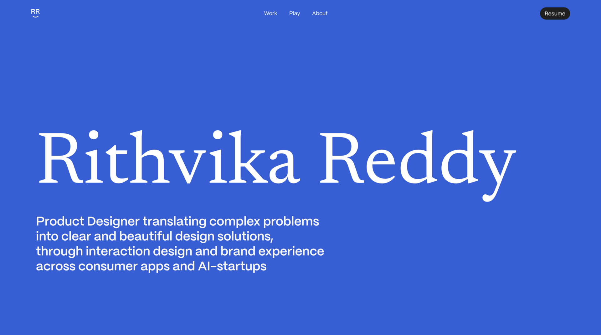
Rithvika’s hero section is a model of clarity: her name in a confident serif headline, followed by a single line that captures who she is, what she does, and who she does it for:

This is also visually well done to maintain focus and convey taste and maturity
“Product designer translating complex problems into clear, beautiful design solutions through interaction design and brand experience across consumer apps and AI startups.”
It’s precise, relevant, and deeply reflective of her work. The phrasing immediately builds trust — you sense she knows what she’s doing, what she’s good at, and what kind of environment she thrives in. The mention of both interaction design and brand experience maps perfectly to what she shows later in her projects.
This is the kind of positioning line every early-career designer should study: specific, confident, and backed up by evidence in the work. It sets expectations — and then her portfolio meets them.
Integrating brand craft without distraction
Rithvika also handles her multidisciplinary skills exceptionally well. Her portfolio makes it clear that product design is the core, but she threads her brand and visual skills through it with intent rather than noise.
In her Astr case study, she introduces branding as a natural extension of the product story. It’s woven in just enough to show her craft — a brief animated reveal of the identity, a few contextual applications — before returning to interaction and product design. It feels cohesive rather than competing for attention.

An excellent way to drop branding work in a subtle way in a product design case study
And in her Play section, she goes one step further. It’s a curated grid of logos, typography, 3D explorations, and illustrations — each standing on its own, unified by her visual taste. It shows depth and curiosity without overwhelming her core message. That’s not easy to pull off.
For designers wondering how to show range without losing focus, Rithvika’s approach is textbook. She lets her main story be about product design — and uses everything else to reinforce it, not compete with it.
Potential
Quality consistency across projects
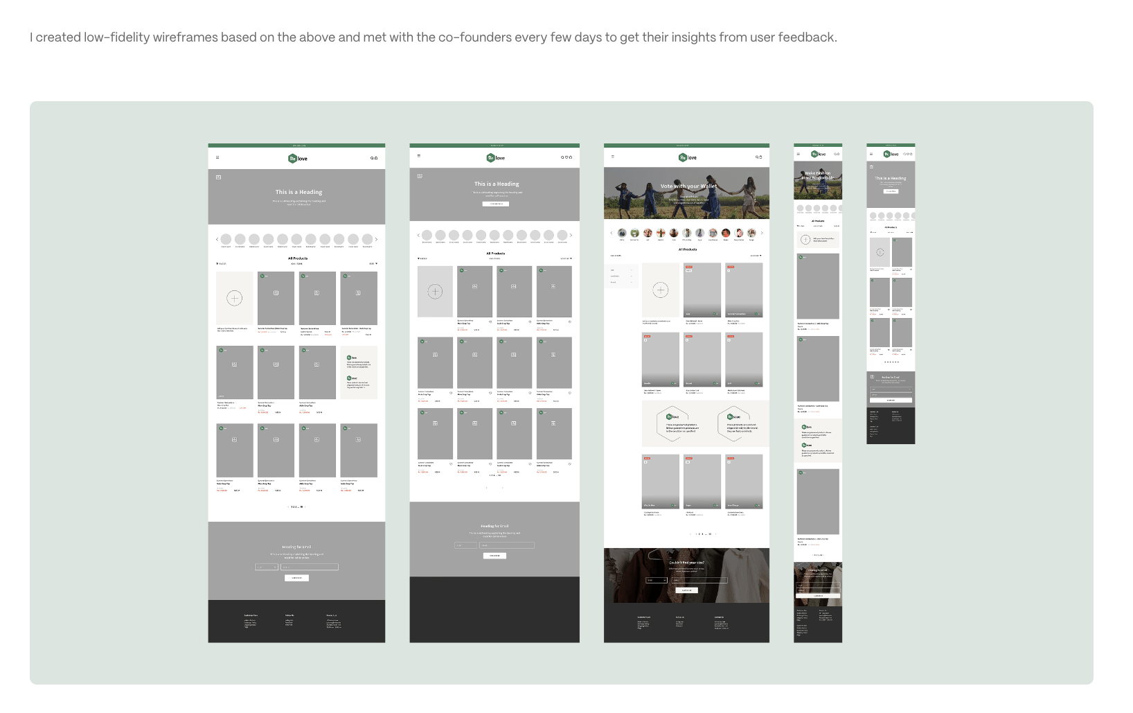
The overall quality of Rithvika’s portfolio is high — but uneven. Her Astr and Bud.ai projects show clear growth, refinement, and strong narrative structure. The Relove.in project, on the other hand, feels dated in comparison: less polished, less structured, and visually weaker.
Because it’s the second project on the homepage, it risks diluting the first impression. If a recruiter or hiring manager lands there first — especially one looking for consumer or e-commerce experience — they might stop before reaching her stronger work.

This is definitely not on the same level in terms of presentation and storytelling than her other case studies
The easiest fix: archive or hide Relove from the homepage. It can remain in the background as a link for e-commerce-specific applications, but right now it sets the wrong baseline. Curating around quality rather than relevance will make the entire portfolio feel sharper — and still won’t close any doors.
Bring impact into the story
Rithvika’s case studies are well written and well structured, but they stop short of discussing impact. She closes each one with a thoughtful reflection — what she learned, what she’d improve — but there’s little about measurable outcomes or the value her work created.
That’s a missed opportunity. Even fictional or academic projects can include a statement of intended impact: What business metric would this move? What user behavior would it change? What problem did this actually solve?
Adding even one paragraph per case study that connects the design outcomes to business or user impact would elevate her portfolio from polished to persuasive. It would show not just that she can design beautifully, but that she can design effectively.
Final Thoughts
Rithvika’s portfolio is one of the most cohesive and mature early-career showcases I’ve featured recently. It balances brand sensibility with product thinking in a way that feels intentional and natural. Her positioning is among the strongest we’ve seen — and her visual presentation is both elegant and restrained.
With a bit more curation and a stronger emphasis on outcomes, this could easily stand beside mid- to senior-level portfolios. For designers wondering how to blend multiple disciplines while keeping focus, Rithvika’s work is an excellent example of how to do it right.
No surprise but Rithvika’s portfolio was done with Framer.
Still struggling to get your portfolio off the ground?
Don’t want to spend weeks learning yet another tool? Framer is my top recommendation for building your portfolio — fast, clean, and without the usual headaches.
Those lovely blur and subtle scroll effects in Rithvika’s portfolio? Super easy to achieve with Framer. If you dream it, Framer enables you to build it without coding or any other steep learning curve.
If you’re just starting out (or even if you’re not), I think Framer is a perfect fit. Here’s why:
Flat learning curve: The interface feels familiar if you’ve used Figma — plus, there’s a plugin to bring your designs straight in.
Plenty of learning support: Framer Academy is packed with free tutorials, videos, and guides to help you go from zero to published.
A huge template library: Tons of high-quality (often free) templates in the marketplace to help you launch quickly without starting from scratch.
And that’s just scratching the surface. I wrote more about why I recommend Framer here—but honestly, the best way is to try it for yourself.
Affiliate disclaimer: I only recommend tools I personally believe in. Some links in this post are affiliate links, which means I may earn a small commission if you choose to purchase — at no extra cost to you.
How I can help YOU
Do you want your own portfolio reviewed in-depth with a 30-minute advice-packed video review? Or do you require mentoring to figure out a proper strategy for your job search?
I got you!
Book a mentoring session with me
Book a quick 15 min chat to ask a question and see if we vibe
Florian BoelterFlorian Boelter is a product designer, mentor and builder focussed on helping early-career designers navigate the job search and the first steps on the job. If my content helps you in any way I’d appreciate you sharing it on social media or forwarding it to your friends directly! |
