- Open Doors
- Posts
- Junior Portfolio Showcase: Nimisha Malreddy
Junior Portfolio Showcase: Nimisha Malreddy
A wildly original surface with real promise beneath it.

Today: Nimisha Malreddy
Nimisha Malreddy is a product designer based in New York with a Master’s in UX Design from Pratt Institute. Her most visible experience comes from designing at The Metropolitan Museum of Art — and her portfolio leans into that strength in all the right ways. She presents herself as someone who cares deeply about inclusive experiences, and the work she showcases consistently reinforces that narrative.
This is a grounded, well-assembled portfolio. It avoids flash-for-flash’s-sake and instead relies on solid storytelling, clear structure, and strong fundamentals. It doesn’t try to overwhelm, yet it’s memorable because of the substance and consistency behind every case study.
Let’s look at what makes this portfolio strong — and where a few strategic adjustments could help it level up further.
The Good
A cohesive, authentic design identity
Nimisha’s portfolio does something many early-career designers struggle with: it forms a coherent picture of who she is. Even though her body of work spans multiple types of problems, she presents herself as a designer who deeply values inclusivity, accessibility, and thoughtful crafting of user journeys — and her case studies back that up.
Her intro sentence is simple but effective:
“Passionate about designing inclusive experiences and currently exploring GenAI as a medium of prototyping.”
The “passionate” phrasing is slightly generic, but the positioning still lands because her case studies repeatedly touch on accessibility, inclusivity, and responsible design. Nothing feels disconnected or performative. The way she synthesizes research findings, the way she frames her design decisions, the nature of the projects she chooses — it all reinforces the same message.
For someone early in her career, this coherence is a major asset. It makes her memorable in a way that portfolios with scattered, unfocused project selections rarely are.
Clear, simple, effective storytelling
Nimisha’s storytelling is grounded, readable, and well structured. This portfolio doesn’t rely on clever tricks or heavy visual theatrics — and it doesn’t need to. It’s clean, linear, and easy to follow.
A few things she consistently does well:
Bold, readable typography that guides the reader
Well-framed sections using purposeful headings
Minimal but meaningful text, avoiding the trap of long-winded paragraphs
Screens, GIFs, and recordings used intentionally, not merely as decoration
Consistent structure across case studies, creating predictability for the reader

Using video in a section like this is the exact right thing to do
Importantly, she never leaves the reader guessing. Her headings do real narrative work. You can scroll the page reading only titles and still understand the arc of each project. It’s a portfolio that respects the hiring manager’s cognitive load.
For anyone looking to build a simple-but-strong portfolio without theatrics, this is an excellent example of how to do it right.
The Potential
Refine the polish: spacing, hierarchy, and visual consistency
The foundation of Nimisha’s portfolio is solid — but there is noticeable variance in typography, spacing, and visual precision across case studies. These inconsistencies can subtly undermine an otherwise strong impression, especially for hiring managers in consumer or product-focused environments.
A few patterns worth tightening:
Heading hierarchy drifts — some pages begin with clean hierarchy while others mix sizes, weights, and spacing unpredictably.
Line heights and section spacings vary across the same page, creating unintended visual noise.
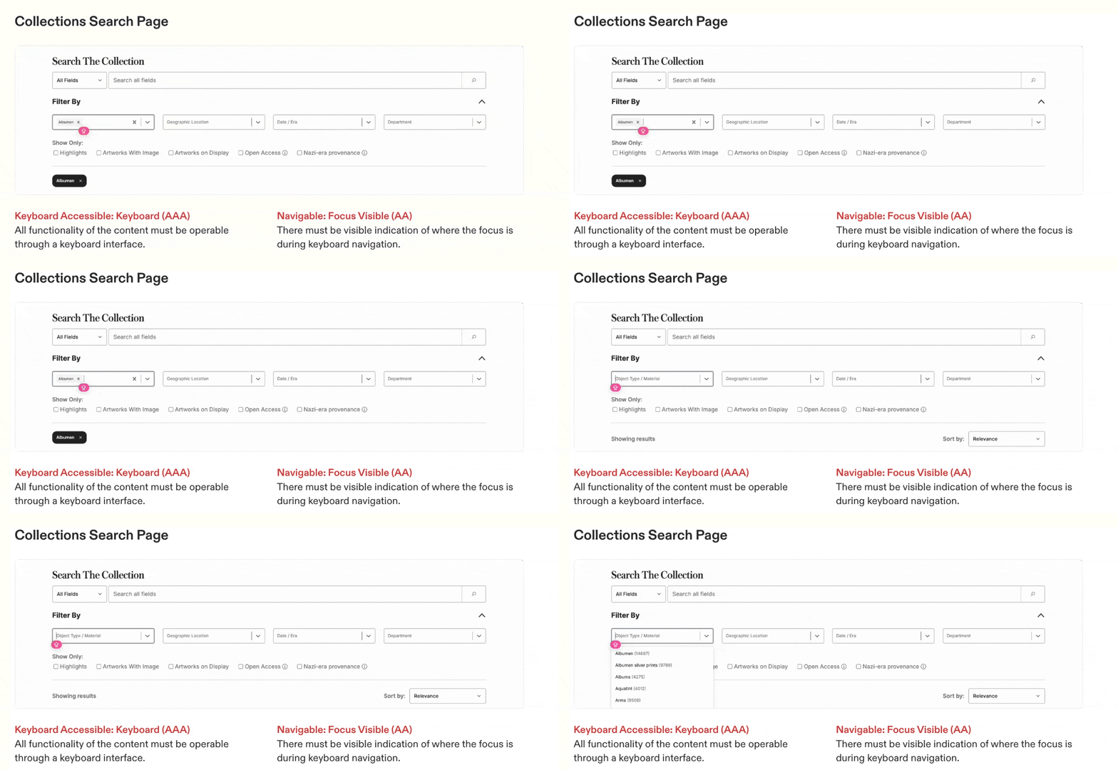
Strategic visuals are mixed with “artifact dumps” — screenshots of audits, matrices, or research boards that add no real scannable value.
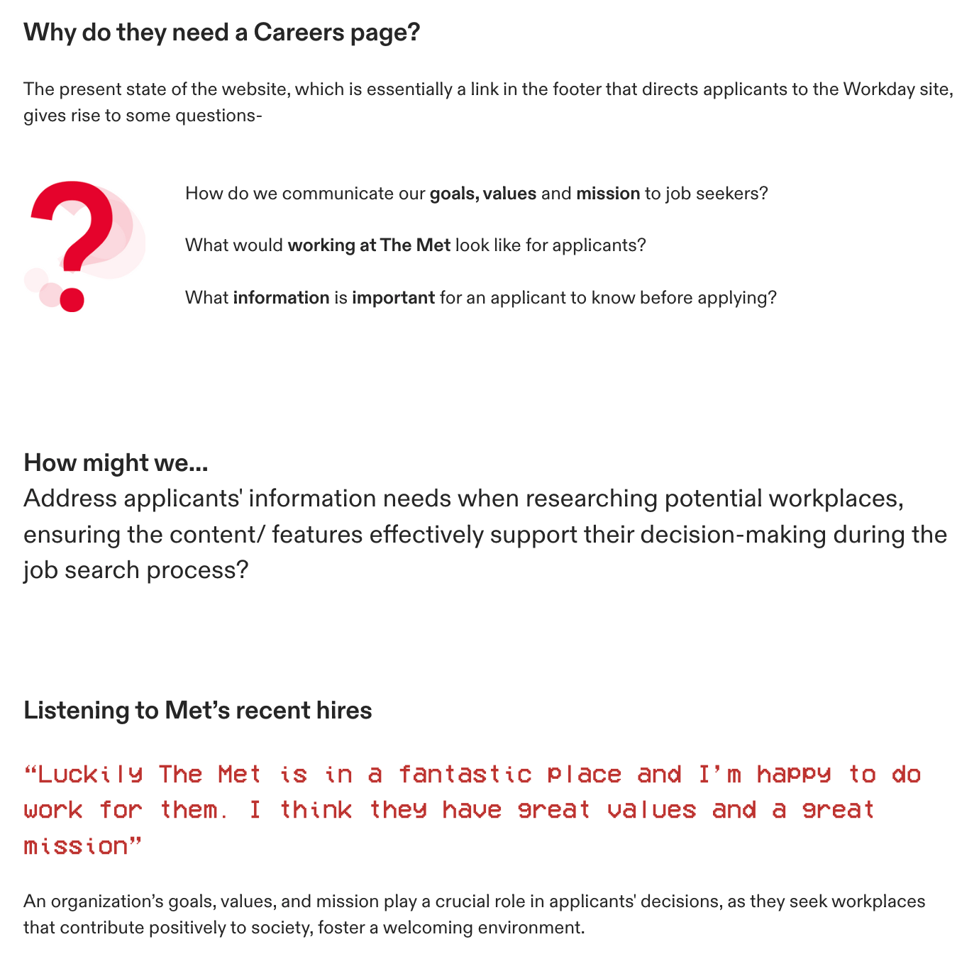
In the Met case study, for example, the analysis section includes visuals impossible to actually read; they communicate volume, but not insight.

Typography is a bit all over the place here. Things like this will be noticed by hiring managers quickly and they do not give bonus points
None of this suggests a lack of skill — quite the opposite. Her strengths are visible, which is why these details matter. A more consistent typographic and visual rhythm would elevate her portfolio to a level fully aligned with her demonstrated capabilities.
Strengthen the sense of impact
Nimisha gestures toward impact in her project titles — “improving hiring experiences,” “supporting digital inclusion,” etc. — but the case studies themselves rarely articulate:
What success looked like
What changed for users or the business
What happened after handoff
Any measurable outcomes (quantitative or qualitative)
This is not unusual for designers at her level. But impact is one of the clearest signals hiring managers look for, especially when choosing between similarly skilled candidates.
And the good news: she almost certainly can uncover this information.
Most interns and junior designers, when they reach back out to former managers or teammates, discover that:
their work was implemented,
or informed a roadmap direction,
or improved a process,
or was tested with users,
or triggered follow-on work.
Even a single sentence of real-world outcome dramatically strengthens a case study. If she revisited the Met project or her other collaborations and gathered even small impact anecdotes, it would reinforce the credibility her portfolio already suggests.
The Verdict
Nimisha Malreddy has a strong, thoughtful, and genuinely enjoyable portfolio — one that communicates both depth and care. Her storytelling is clear, her design foundations are solid, and her identity as a designer comes through without needing to be oversold.
The next step isn’t reinvention — it’s refinement.
With tighter visual polish and clearer articulation of impact, she could easily move this portfolio from “solid and compelling” to “top-tier early-career candidate.” The substance is there. The potential is unmistakable. A few targeted adjustments will help ensure that the first impression fully aligns with the quality of the work behind it.
Nimisha didn’t use Framer to build her portfolio — but very well could have.
Still struggling to get your portfolio off the ground?
Don’t want to spend weeks learning yet another tool? Framer is my top recommendation for building your portfolio — fast, clean, and without the usual headaches.
Nimisha’s portfolio is simple and without any fluff. While that sounds straightforward, the devil often is in the detail. Not with Framer though. A surface like Nimisha’s can be build in no time with Framer and you can easily go beyond when it comes to interactions and more.
If you’re just starting out (or even if you’re not), I think Framer is a perfect fit. Here’s why:
Flat learning curve: The interface feels familiar if you’ve used Figma — plus, there’s a plugin to bring your designs straight in.
Plenty of learning support: Framer Academy is packed with free tutorials, videos, and guides to help you go from zero to published.
A huge template library: Tons of high-quality (often free) templates in the marketplace to help you launch quickly without starting from scratch.
And that’s just scratching the surface. I wrote more about why I recommend Framer here—but honestly, the best way is to try it for yourself.
Affiliate disclaimer: I only recommend tools I personally believe in. Some links in this post are affiliate links, which means I may earn a small commission if you choose to purchase — at no extra cost to you.
How I can help YOU
Do you want your own portfolio reviewed in-depth with a 30-minute advice-packed video review? Or do you require mentoring to figure out a proper strategy for your job search?
I got you!
Book a mentoring session with me
Book a quick 15 min chat to ask a question and see if we vibe
Florian BoelterFlorian Boelter is a product designer, mentor and builder focussed on helping early-career designers navigate the job search and the first steps on the job. If my content helps you in any way I’d appreciate you sharing it on social media or forwarding it to your friends directly! |
