- Open Doors
- Posts
- Junior Portfolio Showcase: Mitchell Zeller
Junior Portfolio Showcase: Mitchell Zeller
A thoughtfully crafted portfolio that blends product design and front-end development with clarity and style

Today: Mitchell Zeller
Mitchell Zeller’s portfolio is a great example of an early-career designer getting the core ingredients right.
A product designer and front-end developer based in Australia, Mitchell strikes a strong balance between thoughtful presentation and technical range. His recent redesign sets solid foundations — and while there are still a few loose ends, what’s already there makes for an encouraging and promising showcase.
Let’s dive into what Mitchell is doing well — and two ways to strengthen this already strong foundation.
The Good
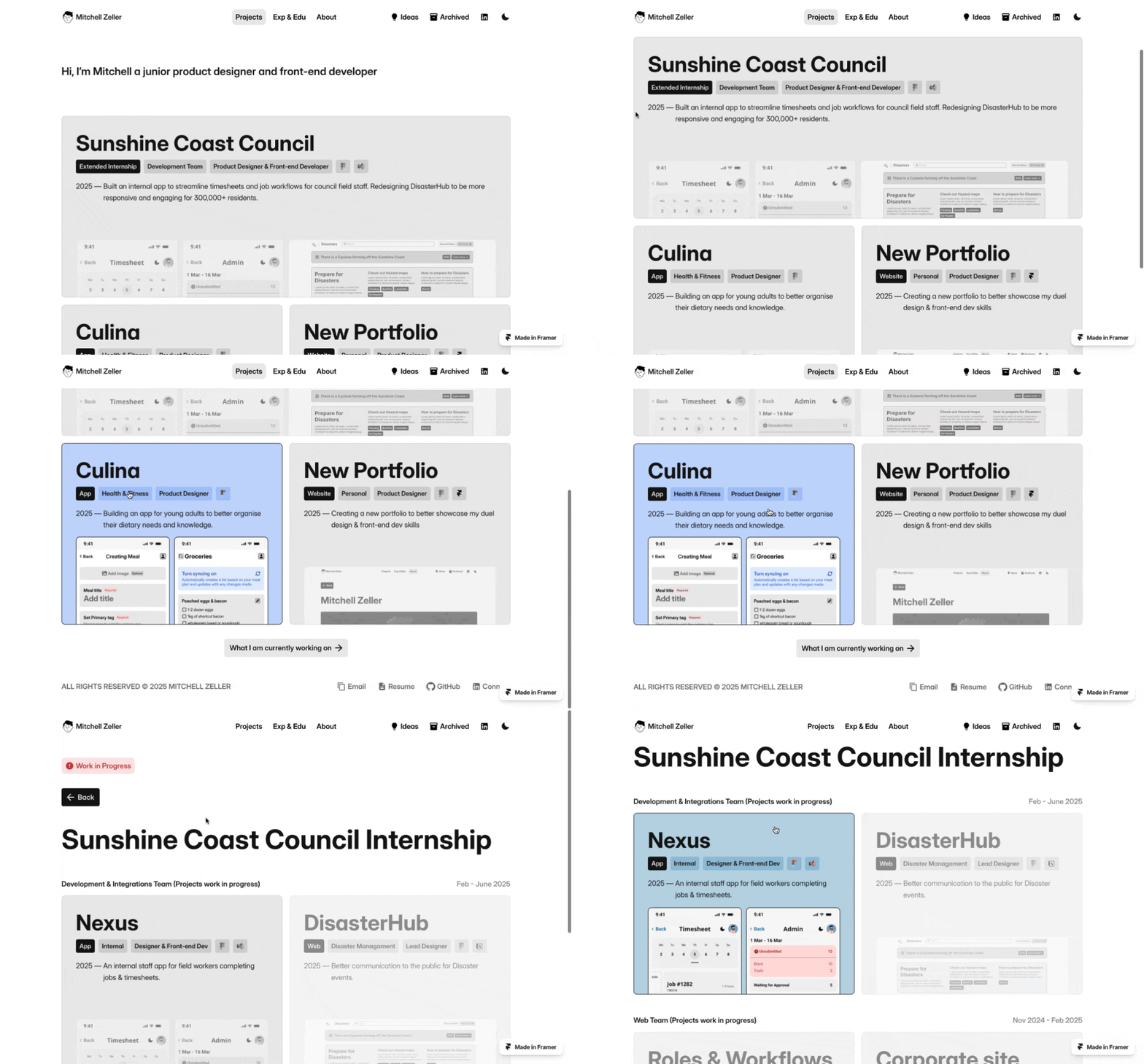
Clean presentation with smart, well-crafted visuals
From the first scroll, Mitchell’s work is presented with care. Hover effects are subtle but intentional. Color transitions feel smooth and considered. And most importantly, his case studies are laid out in a way that supports — rather than distracts from — the actual content.
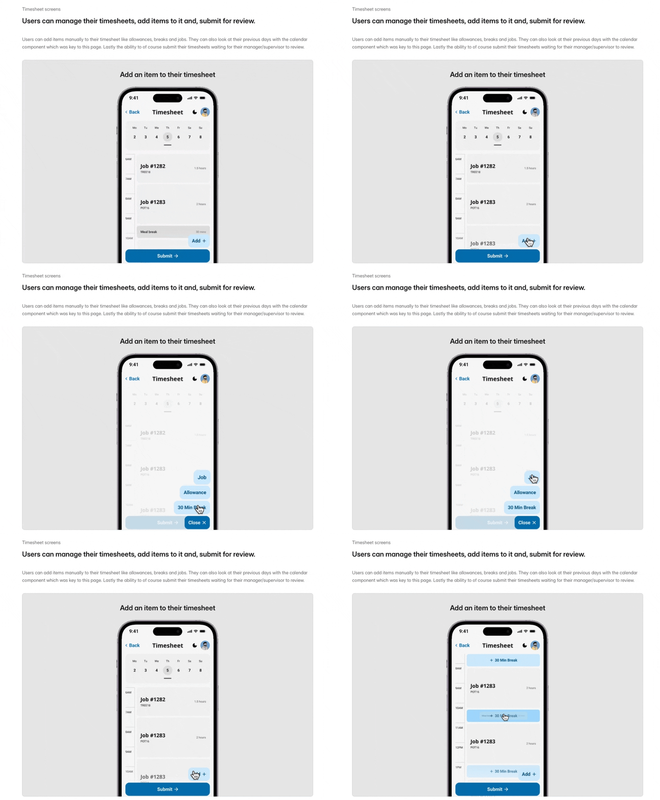
Even better: he avoids the all-too-common trap of dumping endless screens. While there are still moments where multiple screens are grouped together (which we’ll touch on later), Mitchell also smartly incorporates motion, interactions, and lightly annotated visuals to help viewers understand his work at a glance.

Showing how core flows work in a recording is a lot more powerful than any static screenshot could ever be
One standout example: in his Nexus project, he includes moving snippets of core flows, giving clear context for how his designs work in practice. It’s the kind of detail that makes the project feel lived-in — and that elevates the overall polish of his presentation.
A thoughtful bridge between design and development
Mitchell is also navigating the design–dev overlap in a way that feels clear and purposeful — which is hard to do.
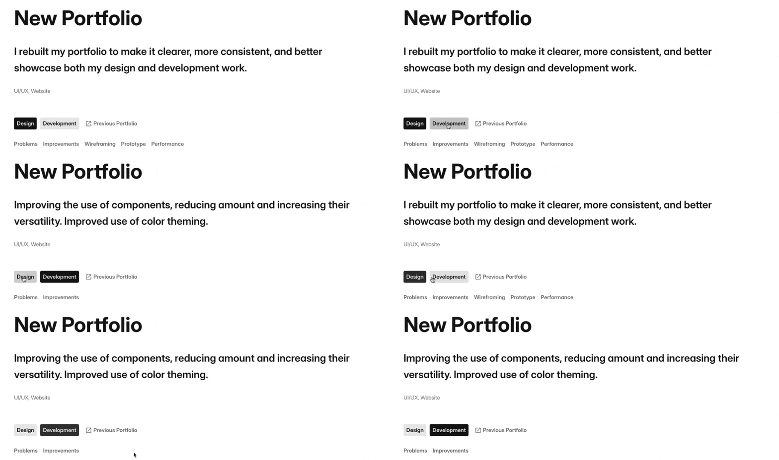
Rather than splitting his portfolio into two separate tracks or mashing them together, he offers a simple toggle inside select case studies that lets you flip between the design and the development perspective. That’s smart. It gives each skill space to breathe without muddying the waters.

This is a brilliant way to avoid clutter and let’s users choose what’s relevant to them
The result is a portfolio that’s not only visually appealing — but also shows that Mitchell can own a project from end to end, across disciplines. That’s a serious asset, especially in early-stage teams or smaller companies looking for designers with range.
The Potential
Clean up unfinished sections and streamline navigation
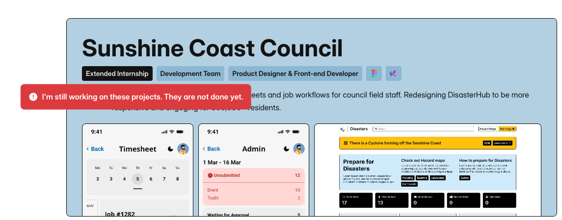
Right now, parts of the portfolio still feel like a work in progress — and Mitchell acknowledges that directly. But instead of adding disclaimers or inactive case study links, we’d recommend a different approach: only show what’s ready.
If there’s one strong case study already available, make that the focus. Bring it front and center. Don’t dilute it with placeholders or work-in-progress tooltips — especially not red ones, which feel more like warnings than teasers.

That felt dangerous (although it isn’t)
There’s also some light navigational clutter: multiple top-level links (Projects, Experience, Education, About) are joined by less central ones (Ideas, Archive) that aren’t always populated. Consolidating some of this — or moving secondary content into a dedicated section further down the homepage — would make the experience smoother and more focused.
In short: simplify. Let what’s strong shine, and save the rest for when it’s fully ready.
Sharpen your positioning and make your intro work harder
Mitchell’s intro currently reads:
“Junior product designer and front-end developer.”
It’s accurate. But it’s also a missed opportunity.
Your intro is valuable real estate. It’s the first signal people get about who you are — and what makes you different. And especially when you already have strong design and dev skills, there’s no reason to undersell that.
First: drop the “junior.” Your level will be clear from your experience and work — no need to label yourself.
Second: consider adding a few traits, strengths, or interests that help steer your career in the direction you want. Things like:
“Product designer and front-end developer with a focus on consumer-facing apps and design systems”
“I care about clarity, performance, and translating design into high-quality code”
“Bringing designs to life through advanced prototyping and thoughtful product thinking”
Pick 2–3 themes or strengths that reflect how you work — and the kind of roles you want — and bake them in. It’ll make your intro more memorable, and help you attract the right opportunities.
Final Thoughts
Mitchell Zeller’s portfolio is a strong foundation with great promise. His visual polish is there. His way of presenting work is purposeful. And his ability to span design and development is a rare strength.
With a few tweaks — streamlining unfinished sections and sharpening how he talks about himself — he’ll have a portfolio that not only looks good, but works hard on his behalf.
I’m excited to see where he takes it next.
Want to create a visually stunning portfolio like Mitchell’s? Framer can do it!
Still struggling to get your portfolio off the ground?
Don’t want to spend weeks learning yet another tool? Framer is my top recommendation for building your portfolio — fast, clean, and without the usual headaches.
Little to no surprise that Mitchell used Framer to get his portfolio re-started. While Mitchell can leverage code he still chose Framer as a base for it instead of coding from scratch. The great thing about Framer is that you can build the foundation easily and then go deep if you want / need to—even with code if you can or want!
If you’re just starting out (or even if you’re not), I think Framer is a perfect fit. Here’s why:
Flat learning curve: The interface feels familiar if you’ve used Figma — plus, there’s a plugin to bring your designs straight in.
Plenty of learning support: Framer Academy is packed with free tutorials, videos, and guides to help you go from zero to published.
A huge template library: Tons of high-quality (often free) templates in the marketplace to help you launch quickly without starting from scratch.
And that’s just scratching the surface. I wrote more about why I recommend Framer here—but honestly, the best way is to try it for yourself.
Affiliate disclaimer: I only recommend tools I personally believe in. Some links in this post are affiliate links, which means I may earn a small commission if you choose to purchase — at no extra cost to you.
How I can help YOU
Do you want your own portfolio reviewed in-depth with a 30-minute advice-packed video review? Or do you require mentoring to figure out a proper strategy for your job search?
I got you!
Book a mentoring session with me
Book a quick 15 min chat to ask a question and see if we vibe
Florian BoelterFlorian Boelter is a product designer, mentor and builder focussed on helping early-career designers navigate the job search and the first steps on the job. If my content helps you in any way I’d appreciate you sharing it on social media or forwarding it to your friends directly! |
