- Open Doors
- Posts
- Junior Portfolio Showcase: Manasi Ghutukade
Junior Portfolio Showcase: Manasi Ghutukade
A warm, well-crafted portfolio that already feels distinctly personal.
Florian Bölter
January 28, 2026
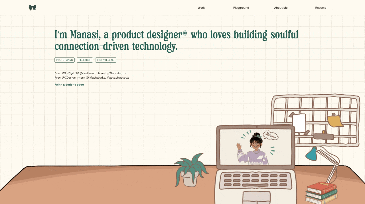
Today: Manasi Ghutukade
Today we’re looking at the portfolio of Manasi Ghutukade, a product design student at Indiana University Bloomington, graduating in 2026. She already brings real-world experience to the table through an internship at MathWorks — a highly complex, technical product environment — while also showing work that leans much more consumer-facing.
That combination alone makes this portfolio interesting. What stood out to me immediately, though, is how personal and cohesive it feels. This is not a generic student portfolio. It’s illustrated, lightly animated, warm, and unmistakably hers. There’s a clear point of view here, and that matters a lot — especially at this stage.
This is already a strong portfolio. And with a few focused improvements, it could become a genuinely standout one by the time she hits the job market.
The Good
A strong sense of personality and intentional warmth
The first thing that works very well here is personality — not in a forced or performative way, but in a controlled, thoughtful one.
The hero section sets the tone immediately: grid-paper background, hand-drawn desk illustration, a playful character welcoming you in, paired with type that supports that softer, more human feel. It’s cohesive and inviting without becoming gimmicky.

A lovely way to be greeted in a portfolio
What’s important here is why this works. This isn’t personality for the sake of personality. It communicates how Manasi likely approaches design work: thoughtful, gentle, detail-oriented, and experience-focused. Even when she’s worked on highly complex systems, this presentation suggests care and empathy in how she tackles problems.
That will resonate strongly in consumer-facing environments, education, health, or any product space where tone and experience matter. And just as importantly: it filters. Teams looking for ultra-corporate, buttoned-up design cultures may not be the right fit — and that’s okay.
Nothing here feels overdone. The illustrations support the work instead of competing with it. That balance is hard to get right, and she does.
Clear, efficient storytelling inside the case studies
Manasi’s case studies are relatively short — and that’s a strength.
They’re easy to scan, easy to understand, and they surface meaningful insights quickly. She’s not afraid to talk about impact, trade-offs, technical constraints, or experience quality. There’s a good balance between user perspective, business awareness, and craft.

The supporting illustrations do an amazing job here
You can also see that storytelling is not an afterthought. She understands that design work doesn’t speak for itself unless you guide the reader. The narrative generally flows well, and even when projects are constrained (like the MathWorks work under NDA), the intent and value of her contribution still come through.
One small note — and this is a refinement, not a flaw: her headings are often quite generic (“Impact,” “My Learnings,” etc.). Making those headings more descriptive would elevate scannability even further. But even as-is, the content underneath is strong enough that the story still lands.
Overall, this is solid, thoughtful storytelling — especially for a student portfolio.
The Potential
Work presentation doesn’t yet match the quality of the work itself
This is the biggest opportunity area.
Across several case studies — particularly the iHeartMedia and Bloomwell projects — the way screens are presented holds the work back. We see repeated patterns of:
Two or more static screens side by side without clear context
Small mockups that are difficult to read
Old-style “grids of screens” that feel dated for consumer-facing work
Limited use of motion, even where interaction is clearly central to the solution
In multiple places, a short screen recording of the actual user flow would communicate far more than static comparisons. One well-chosen, clearly visible flow would often be enough — and would reduce visual clutter at the same time.
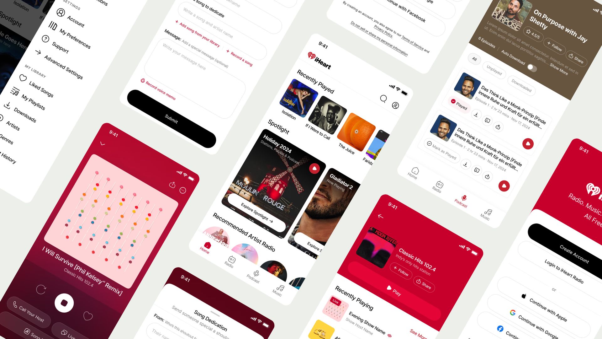
This one feels a bit 2019
This isn’t about adding polish for polish’s sake. It’s about clarity. If a reader has to work to understand what changed, the value of the work is diminished — even if the underlying design decisions are strong.
Manasi already uses motion effectively in at least one project. Extending that approach consistently across case studies would immediately elevate how her work is perceived.
Project previews leave too much value untapped
The second opportunity is on the homepage.
Right now, project previews lead with product or company names, a list of responsibilities, and supporting visuals. While clean, this approach doesn’t give viewers a compelling reason to click — especially when the product names themselves are unfamiliar.
The real strength of Manasi’s work lies in impact — and that’s currently hidden inside the case studies.
Instead of leading with product names, she could lead with outcomes:
What changed
What improved
Why the work mattered
Even one short, specific line can dramatically increase click-through. Pair that with a clearer, more legible visual — ideally a cropped recording or focused mockup — and these previews would do far more work for her.
This is an easy fix, but a high-impact one. Better previews mean more people actually see the strong work she’s already done.
The Verdict
Manasi’s portfolio is already doing many things right. It’s personal, coherent, and grounded in solid design thinking. Her storytelling is clear, her intent is thoughtful, and her work shows both versatility and care.
The main gap isn’t skill — it’s presentation. By refining how her work is shown and how projects are framed upfront, she can significantly increase the portfolio’s effectiveness without redesigning everything.
This is a portfolio that already feels human and considered. With a sharper focus on visual clarity and impact-led framing, it has all the ingredients to become genuinely memorable by graduation.
Manasi used Framer — which you can get for free as a student!

Still struggling to get your portfolio off the ground?
Don’t want to spend weeks learning yet another tool? Framer is my top recommendation for building your portfolio — fast, clean, and without the usual headaches.
If you’re just starting out (or even if you’re not), I think Framer is a perfect fit. Here’s why:
Flat learning curve: The interface feels familiar if you’ve used Figma — plus, there’s a plugin to bring your designs straight in.
Plenty of learning support: Framer Academy is packed with free tutorials, videos, and guides to help you go from zero to published.
A huge template library: Tons of high-quality (often free) templates in the marketplace to help you launch quickly without starting from scratch.
Free if you are a student: Although Framer already offers a generous free plan for everyone, if you are an enrolled student you can get Framer Pro completely for free!
And that’s just scratching the surface. I wrote more about why I recommend Framer here—but honestly, the best way is to try it for yourself.
Affiliate disclaimer: I only recommend tools I personally believe in. Some links in this post are affiliate links, which means I may earn a small commission if you choose to purchase — at no extra cost to you.
How I can help YOU
Do you want your own portfolio reviewed in-depth with a 30-minute advice-packed video review? Or do you require mentoring to figure out a proper strategy for your job search?
I got you!
Book a mentoring session with me
Book a quick 15 min chat to ask a question and see if we vibe
Florian BoelterFlorian Boelter is a product designer, mentor and builder focussed on helping early-career designers navigate the job search and the first steps on the job. If my content helps you in any way I’d appreciate you sharing it on social media or forwarding it to your friends directly! |