- Open Doors
- Posts
- Junior Portfolio Showcase: Leo Fu
Junior Portfolio Showcase: Leo Fu
A sharp, action-biased portfolio that explains his fast rise better than any resume could.

Today: Leo Fu
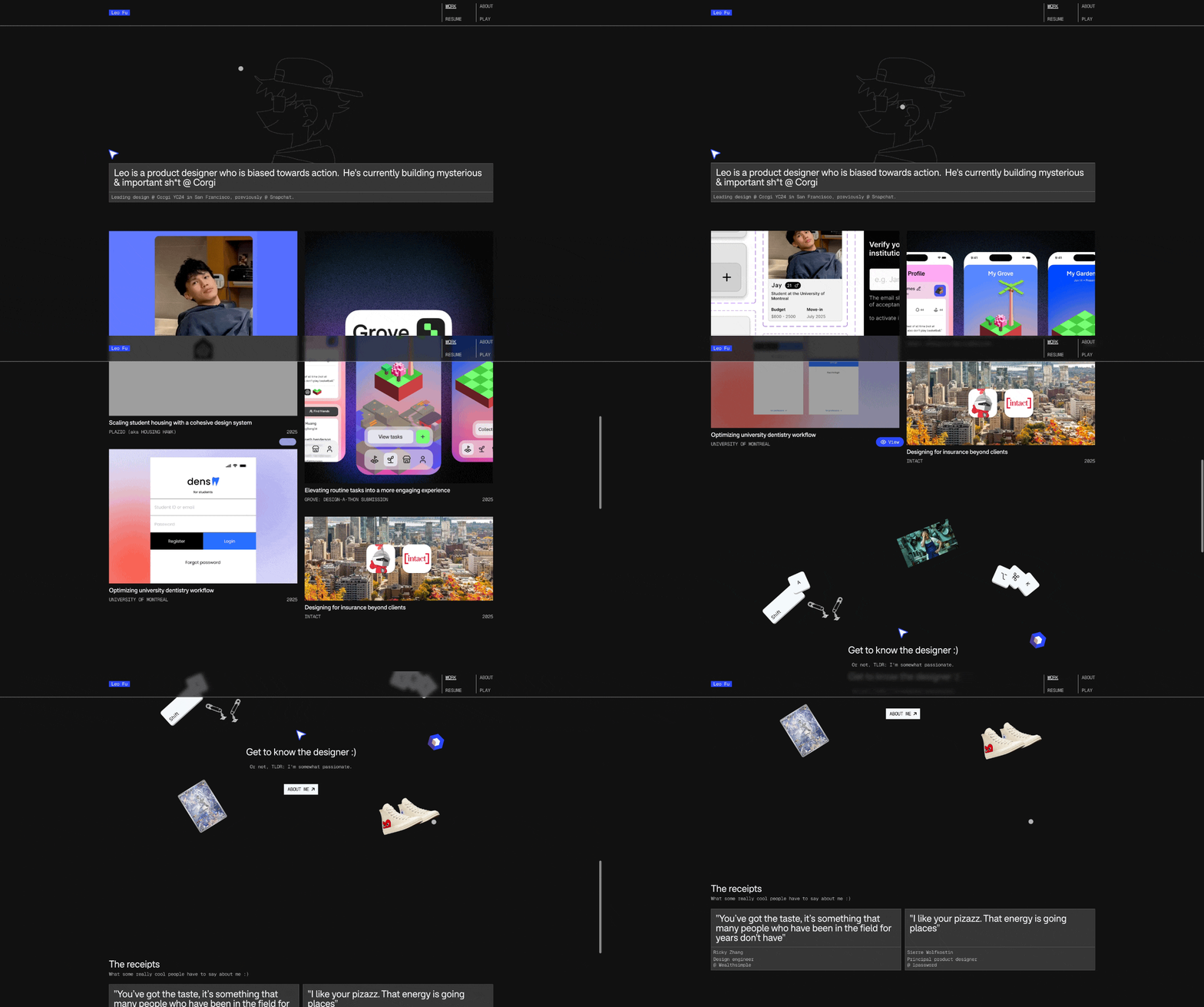
Leo Fu’s portfolio is a strong example of what can happen when clarity, momentum, and taste come together early in a designer’s career. Leo hasn’t been in the industry long — he was a student just last year — but he’s already moved quickly through internships, worked at Snap, and is now designing at Corgi, a YC-backed startup in San Francisco.
At first glance, the portfolio doesn’t shout for attention. It’s not maximalist or flashy for the sake of it. But the more time you spend with it, the clearer it becomes why Leo advanced so fast. This is a portfolio built by someone who understands what hiring managers actually look for: evidence of judgment, ownership, and forward motion — not just polished screens.
There’s also a strong sense of personality throughout. Leo doesn’t hide behind neutral language or generic positioning. A quote on his homepage from a Principal Designer at 1Password reads, “I like your pizzazz. That energy is going places.” That line captures the portfolio well. It feels confident, slightly scrappy, and very intentional about the kind of environments Leo wants to work in.
Let’s break down what makes this portfolio work so well — and where a bit more refinement could take it even further.
The Good
He understands the hiring journey — and designs for it explicitly
One of the strongest things about Leo’s portfolio is that it clearly understands how recruiters and hiring managers actually move through work.
His introduction is personal and decisive. The language is bold — even polarizing — but that’s the point. He frames himself as action-biased and unapologetically hands-on, which immediately filters for the kinds of teams he’ll thrive in. Some people might be turned off by that tone — and that’s fine. Those are probably not the teams Leo wants to join anyway.
From there, the portfolio flows exactly as it should. The project previews are concise and visually engaging, with subtle animations on most of them that give you a quick sense of the product without overwhelming you. The titles do their job: they’re clear, grounded, and make you want to click. They could be slightly more impact-oriented, but they already perform well as entry points.
Inside the case studies, the structure stays disciplined. Leo doesn’t over-explain. He leads with value, clearly articulates how he contributed, and moves quickly into problem framing, discovery, and outcomes. Sections like “How did I add value?” are especially effective — not because they’re flashy, but because they directly answer the question every hiring manager is silently asking.

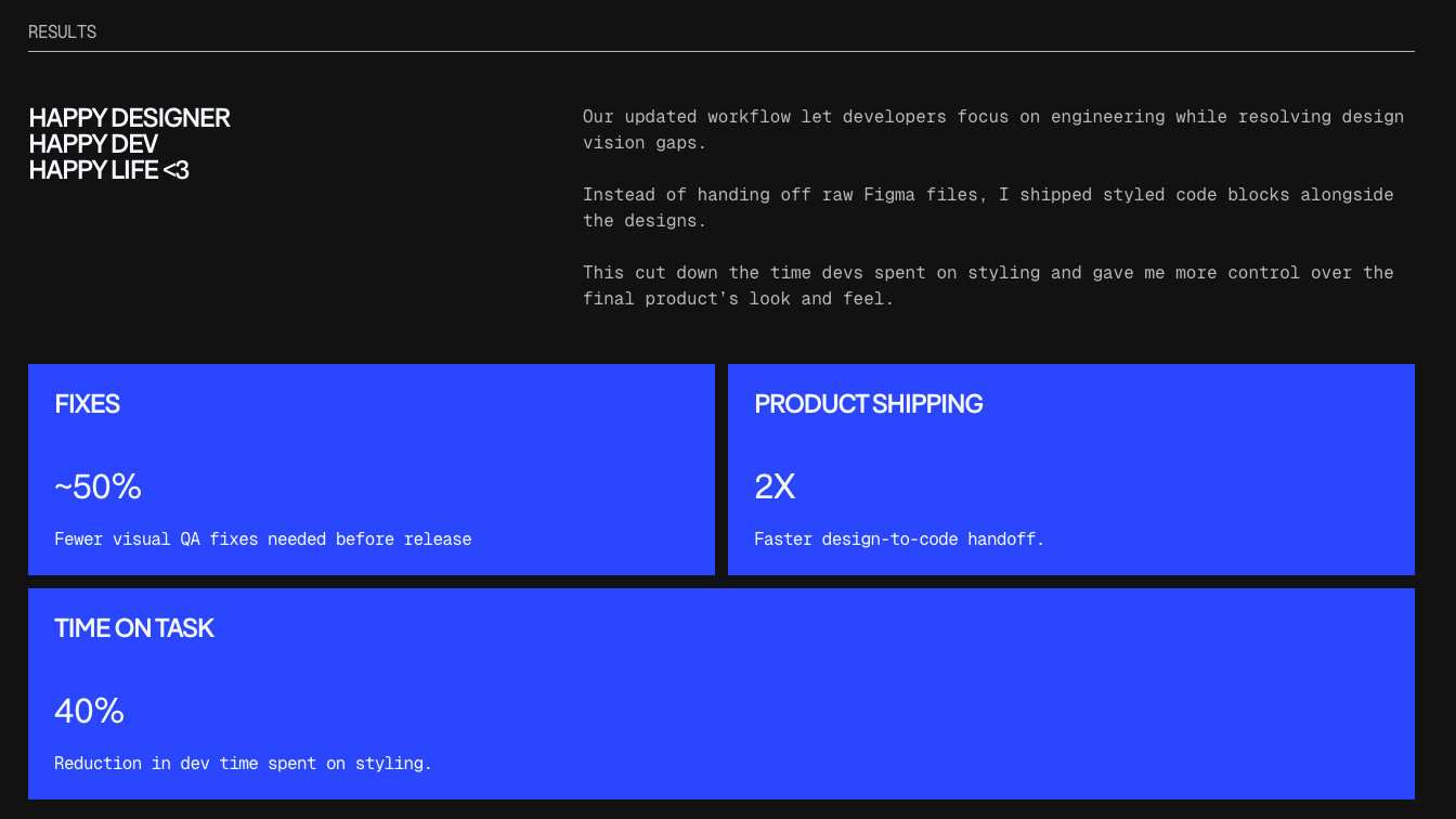
An amazing way to highlight results that no one can miss
Results are highlighted clearly, both in text and visually. You can skim the headings and still understand the story. You can read more deeply and see thoughtful decision-making underneath. That balance is hard to get right, and Leo gets it right more often than most early-career designers.
He’s not afraid of code — and uses it strategically
Another standout aspect of Leo’s portfolio is his comfort operating close to implementation.
In the Plazio case study, Leo doesn’t just design components — he contributes code. He explains how he worked with existing libraries, how he styled and adapted components, and where the approach worked well or hit constraints. Importantly, he doesn’t overclaim. He’s clear about what he owned and what he learned.

Just talking about this is a strong signal in this market
This is a powerful signal, especially for early-stage companies. It shows that Leo can help close the gap between design and shipping — not by replacing engineers, but by collaborating more fluidly with them. As design and development workflows continue to converge, this kind of experience becomes a real differentiator.
What matters most here isn’t technical perfection. It’s mindset. Leo comes across as curious, unafraid, and willing to step into unfamiliar territory to move work forward. For many teams — especially startups — that matters more than pristine visual polish.
The Potential
Some foundational visual details still need tightening
While Leo clearly has taste and strong instincts, there are moments in his work where the fundamentals could be sharpened further.
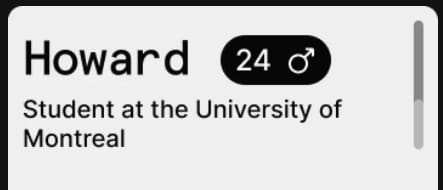
In both the Plazio and Dens projects, there are small inconsistencies in spacing, alignment, and typographic rhythm. Things like uneven padding in menus, slightly loose relationships between UI elements, or typography that could benefit from more deliberate control of line height and letter spacing.

The spacing and typography work here could use a little polish
These are not major issues, and they’re especially understandable given how early Leo is in his career. Most non-designers will never notice them. But as Leo grows — particularly if he moves into more craft-driven or consumer-facing environments — these details will start to matter more.
The good news is that this kind of refinement comes naturally with time and repetition. The underlying judgment is already there. A bit more intentional slowing down and reviewing of final details will compound quickly.
The case studies underplay the quality of the work at times
One of the few mismatches in the portfolio is between the strong first impression on the homepage and how some of the work is presented inside the case studies.
On the homepage, animated previews set a high expectation. Once inside the case studies, some of the initial visuals feel less considered. For example, opening sections that show multiple unrelated mockups side-by-side don’t always add clarity. Large static images — including one pixelated hero mockup — feel more like placeholders than deliberate storytelling choices.

That’s not a strong follow-up to seeing those amazing animations on the homepage
Further down, the presentation improves, especially where Leo uses interactive annotations or shows flows in context. But overall, the work itself sometimes feels slightly underrepresented compared to how strong it actually is.
This isn’t a problem of ability — it’s a problem of framing. With more selective, higher-resolution visuals and a stronger emphasis on showing designs in use, the case studies could better match the confidence and energy established on the homepage.
The Verdict
Leo Fu’s portfolio explains his rapid career progress better than any timeline could.
It shows someone who understands how to create value, communicate it clearly, and move fast without losing sight of outcomes. The combination of action-bias, early technical fluency, and solid storytelling makes this an especially strong portfolio for startup and scale-up environments.
The areas for improvement are real, but they’re also the kinds of things that resolve themselves naturally as Leo continues to design, ship, and refine his craft. Nothing here suggests a ceiling — only momentum.
This is a portfolio that already works. With a bit more visual tightening and more intentional presentation inside the case studies, it could become exceptional. And given how quickly Leo has progressed so far, that feels less like a question of if — and more like when.
Leo did his portfolio with Framer — which is totally free for students!
Still struggling to get your portfolio off the ground?
Don’t want to spend weeks learning yet another tool? Framer is my top recommendation for building your portfolio — fast, clean, and without the usual headaches.
If you’re just starting out (or even if you’re not), I think Framer is a perfect fit. Here’s why:
Flat learning curve: The interface feels familiar if you’ve used Figma — plus, there’s a plugin to bring your designs straight in.
Plenty of learning support: Framer Academy is packed with free tutorials, videos, and guides to help you go from zero to published.
A huge template library: Tons of high-quality (often free) templates in the marketplace to help you launch quickly without starting from scratch.
Free if you are a student: Although Framer already offers a generous free plan for everyone, if you are an enrolled student you can get Framer Pro completely for free!
And that’s just scratching the surface. I wrote more about why I recommend Framer here—but honestly, the best way is to try it for yourself.
Affiliate disclaimer: I only recommend tools I personally believe in. Some links in this post are affiliate links, which means I may earn a small commission if you choose to purchase — at no extra cost to you.
How I can help YOU
Do you want your own portfolio reviewed in-depth with a 30-minute advice-packed video review? Or do you require mentoring to figure out a proper strategy for your job search?
I got you!
Book a mentoring session with me
Book a quick 15 min chat to ask a question and see if we vibe
Florian BoelterFlorian Boelter is a product designer, mentor and builder focussed on helping early-career designers navigate the job search and the first steps on the job. If my content helps you in any way I’d appreciate you sharing it on social media or forwarding it to your friends directly! |
