- Open Doors
- Posts
- Junior Portfolio Showcase: Justin Shi
Junior Portfolio Showcase: Justin Shi
Enterprise design done right — and proof that craft absolutely matters beyond consumer apps.
Florian Bölter
March 25, 2026

Today: Justin Shi
This week’s portfolio is from Justin Shi, a product designer based in Los Angeles and currently working at Hewlett Packard Enterprise.
And this is a really important one.
Because lately, a lot of the portfolios we’ve looked at leaned heavily into consumer-facing design. Mobile apps, polished UI, high visual bar, all of that.
Justin’s work sits in a very different space.
Enterprise software.
Now, I know that for many people, that immediately sounds… less exciting. But it really shouldn’t. Because what Justin demonstrates here is something that’s actually much harder:
Delivering high-quality design inside constraints.
Legacy systems. Complex data. Technical limitations. Organizational friction.
And despite all of that, Justin produces work that feels thoughtful, clean, and genuinely well crafted.
That’s not easy.
Let’s break down what makes this portfolio work so well.
NOTE: Justins first two case studies are password protected and I sadly can’t share the password here publicly but in case you are interested please get in touch with him!
The Good
Making enterprise complexity feel simple and understandable
One of the biggest pitfalls in enterprise portfolios is this:
The case study becomes as complex as the product.
You open it, and you’re hit with walls of explanation, endless diagrams, and way too much context.
Justin avoids this entirely.
He worked on Mist (formerly Juniper Mist), a platform for managing large-scale networks like Wi-Fi infrastructure across massive environments. That’s inherently complex.
But instead of over-explaining the system, he focuses on what actually matters:
The problem (low adoption of an existing AI assistant)
The context in which it exists
The decisions he made to improve it
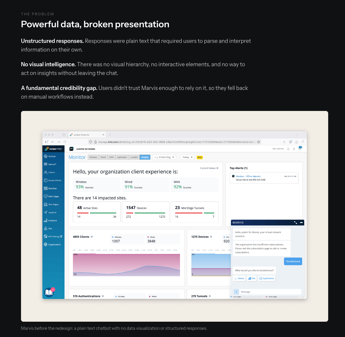
Others would have gone on here for AGES—Justin summarized it with a heading and three bullet points + a good supporting visual
He doesn’t fully explain the entire product. And that’s exactly why it works.
You still understand enough through context.
The real strength here is how he prioritizes clarity over completeness.
Carefully curated visuals
No unnecessary process dumps
No “wall of sticky notes” syndrome
Strong, speaking headings that carry the narrative
In fact, you can skim his case studies just by reading the headings and still understand the story.
That’s how it should be done.
And what makes this even more impressive is that he applies this approach consistently across two very different problems within the same product:
An AI assistant redesign
A 3D-heavy data visualization
Same system. Different challenges. Both clearly explained.
There’s also a subtle but important lesson here:
You don’t need different companies to show range.
You need different problems.
Justin demonstrates that perfectly.
Showing craft and builder skills beyond enterprise work
It’s easy to assume that designers working in enterprise environments don’t focus on craft.
That assumption is wrong.
Justin proves that clearly.
Below his main case studies, he includes a playground section that highlights a completely different side of his skillset.
There are three standout elements:
A fully interactive Pokédex
A stats widget from his esports analytics work
An interactive game picker component
These are not just static visuals. They’re interactive, polished, and clearly built with care.
And this is where things get interesting.
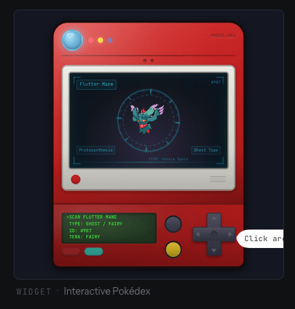
Definitely have a play with the Pokédex!
Because while his main work is enterprise-focused, this section shows:
Strong interaction design
Builder mindset
Likely use of modern tools (vibe coding / AI-assisted development)
That combination is rare.
Especially in enterprise-heavy profiles.
Even better, this section is well curated.
A common mistake is throwing in too many side projects and breaking the cohesion of the portfolio.
Justin avoids that:
4 main case studies
3 focused interactive pieces
Clean, consistent layout
It feels intentional, not cluttered.
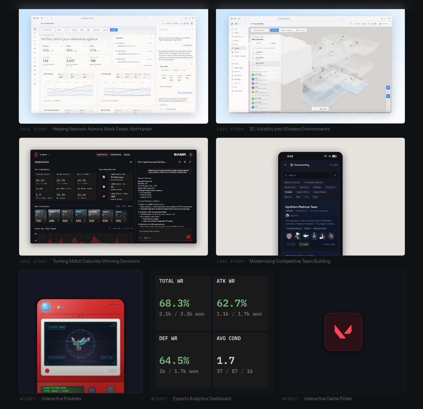
Despite technically featuring 7 things at the same time, this neither feels cluttered not as if it’s losing focus
And even though the Pokémon project stands out thematically, it still works. Because the quality is there.
It adds personality without weakening the overall narrative.
The Potential
Strengthening positioning through a clearer intro
This is the biggest opportunity in Justin’s portfolio.
Right now, his intro reads:
“I design and build my ideas.”
That sounds nice, but it doesn’t say much.
On the side, he includes more detailed information about:
His role at HPE
His background
Previous work
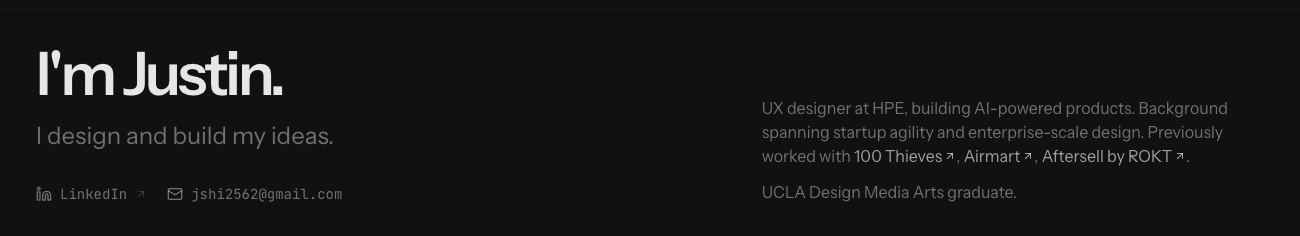
Not bad overall but definitely a lot of missed potential
But visually, that content is de-emphasized.
And that’s the problem.
The most important information is not where the attention is.
What to do instead
Merge both parts into a single, stronger statement.
Keep the “I’m Justin” part.
But replace the rest with something that actually reflects his strengths.
Because his work clearly shows:
Deep experience in enterprise systems
Strong capability in B2B / SaaS environments
Ability to improve complex, data-heavy products
A growing builder mindset
That’s powerful.
And it’s currently under-communicated.
The work does speak for itself, yes. But:
The intro sets the lens through which the work is viewed.
Right now, that lens is too vague.
Extracting more value from the playground and builder work
The playground section is great.
But it’s also underutilized.
Justin shows impressive interactive components, but he doesn’t really explain:
What they are
Why he built them
How he built them
What tools or process he used
For some people, that’s obvious.
For many others, it’s not.
And more importantly:
This is where he could differentiate himself even more.
Because combining:
Enterprise design experience
Strong visual craft
Hands-on building skills
…is a very compelling profile.
What would improve this
Turn these into mini case studies.
Not full pages. Just lightweight context.
For example:
A modal or overlay when clicking a project
Short explanation underneath each component
Quick breakdown of tools and process
Even a few lines would go a long way:
What motivated this
What problem it explores
How it was built
This would also make it clear that he’s working with modern tooling and workflows, which is increasingly valuable.
There’s also a broader opportunity here:
The About page is quite minimal
There’s no footer
No dedicated space to talk about this “builder” side
This is where he could expand the narrative.
Because right now, that story is present — but only implicitly.
The Verdict
Justin Shi’s portfolio is a great example of enterprise design done right.
It shows:
How to simplify complex systems
How to tell clear, concise stories
How to balance depth with readability
How to integrate craft into constrained environments
And importantly, it also hints at something more:
A designer who is not just executing within systems, but starting to build beyond them.
With a bit more clarity in positioning and better storytelling around his builder work, this could become an even stronger and more differentiated portfolio.
But even as it stands:
This is already a very compelling profile — especially for B2B and enterprise roles.
And if you’re someone who thinks enterprise design is boring, this portfolio is a good reminder: It absolutely doesn’t have to be.
If you’d like to craft a similarly impressive portfolio Framer is likely your best choice.

Still struggling to get your portfolio off the ground?
Don’t want to spend weeks learning yet another tool? Framer is my top recommendation for building your portfolio — fast, clean, and without the usual headaches.
If you’re just starting out (or even if you’re not), I think Framer is a perfect fit. Here’s why:
Flat learning curve: The interface feels familiar if you’ve used Figma — plus, there’s a plugin to bring your designs straight in.
Plenty of learning support: Framer Academy is packed with free tutorials, videos, and guides to help you go from zero to published.
A huge template library: Tons of high-quality (often free) templates in the marketplace to help you launch quickly without starting from scratch.
Free if you are a student: Although Framer already offers a generous free plan for everyone, if you are an enrolled student you can get Framer Pro completely for free!
And that’s just scratching the surface. I wrote more about why I recommend Framer here—but honestly, the best way is to try it for yourself.
Affiliate disclaimer: I only recommend tools I personally believe in. Some links in this post are affiliate links, which means I may earn a small commission if you choose to purchase — at no extra cost to you.
How I can help YOU
Do you want your own portfolio reviewed in-depth with a 30-minute advice-packed video review? Or do you require mentoring to figure out a proper strategy for your job search?
I got you!
Book a mentoring session with me
Book a quick 15 min chat to ask a question and see if we vibe
Florian BoelterFlorian Boelter is a product designer, mentor and builder focussed on helping early-career designers navigate the job search and the first steps on the job. If my content helps you in any way I’d appreciate you sharing it on social media or forwarding it to your friends directly! |