- Open Doors
- Posts
- Junior Portfolio Showcase: Justin Mason
Junior Portfolio Showcase: Justin Mason
What happens when strong product thinking meets clear storytelling and real results.
Florian Bölter
April 01, 2026

Today: Justin Mason
Justin Mason is a soon-to-be graduate from the University of Michigan, set to finish in April 2026. And this is a portfolio I’m genuinely happy to feature, because it brings together a couple of qualities that you don’t often see this well combined at this stage.
There’s strong product thinking, clear attention to detail, and a sense of care in how the work is presented. At the same time, the projects themselves carry real weight. Two of them in particular stand out as genuinely impactful pieces of work, and there’s an additional one that adds personality and range in a way that feels intentional rather than filler.
Overall, this is a portfolio that shows a designer who is not just focused on making things look good, but on understanding what makes them work. And that’s exactly what makes it worth taking a closer look.
The Good
Strong product thinking with real business impact
The strongest signal in Justin’s portfolio is his ability to connect design decisions to actual outcomes.
This is not just visually solid work. This is work that understands why it exists.
The email redesign case study is the clearest example. A 22% increase in click-through rate is not trivial. Especially in a job board context, where engagement metrics are notoriously hard to move. And what matters even more is how he explains it.

An extremely strong way to lead on a case study
Justin doesn’t drown you in unnecessary context. He doesn’t over-explain the product. Instead, he focuses on the problem space, the constraints, and the reasoning behind his decisions. That’s exactly the level of abstraction you want.
There’s a level of product thinking here that feels ahead of where he technically is in his career. If you removed the “student” label and just looked at the work, you’d assume this is someone who already has some time in industry.
And that matters.
Because in 2026, being “good at UI” is not enough. The differentiator is whether you understand how your work moves something meaningful. Justin clearly does.
A portfolio that feels human and emotionally engaging
The second thing that stands out is harder to quantify, but just as important.
Justin’s portfolio feels human.
There’s a warmth to how he presents his work that goes beyond polish. It’s not overly playful, not gimmicky, not trying too hard. It just feels considered and personal.
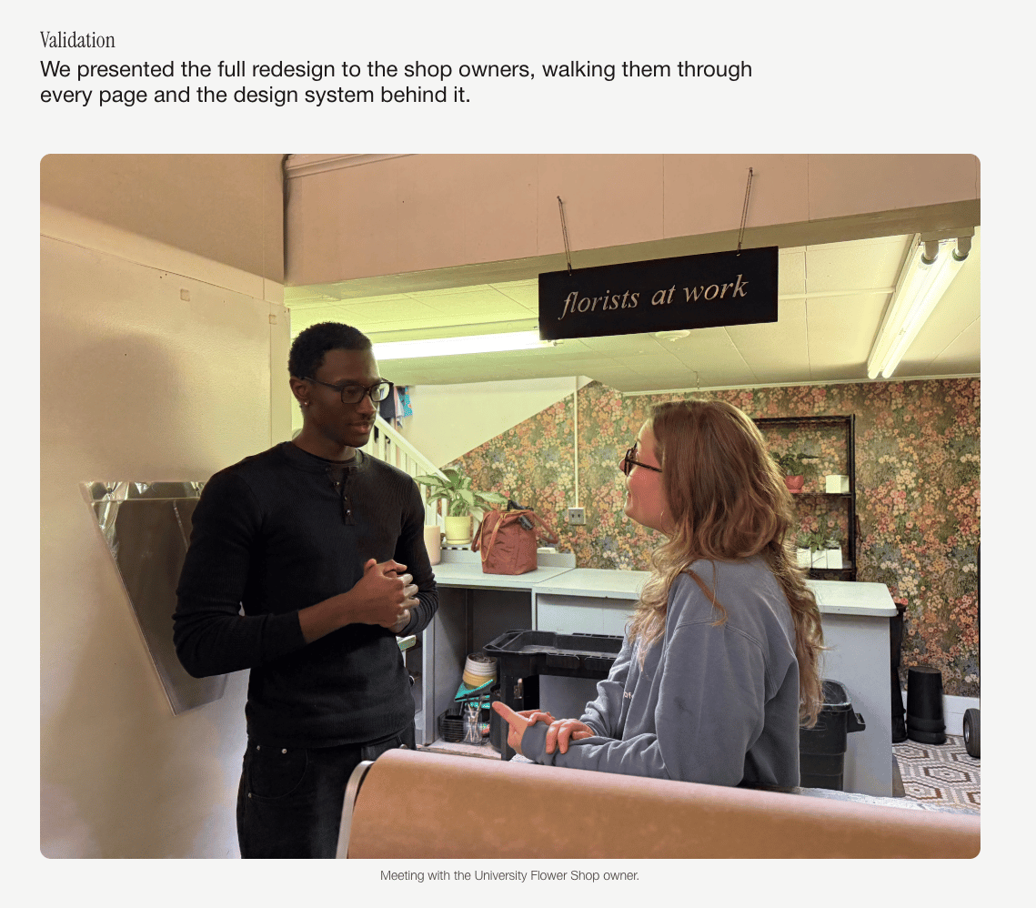
The university flower shop case study is a great example. On paper, this is not the most exciting project. A local business website is something many portfolios include, and most of the time it ends up being fairly generic.
Not here.
Human moments sprinkled in can really put live into a case study
Justin manages to capture the intent behind the project. You can feel the shift toward a younger audience. You can sense the emotional angle of the brand. It doesn’t feel like “here’s the redesign.” It feels like “here’s what this needed to become.”
That’s a big difference.
And overall, his portfolio creates a subtle emotional connection. You feel like you understand how he thinks and what he cares about. In a hiring context, that absolutely matters more than people like to admit.
The Potential
Final polish: small imperfections that stand out at a high level
This is very much end-of-the-race feedback.
Justin’s portfolio is already strong. But because of that, small imperfections become more visible.
A few examples:
The hero animation in the first case study has slight clipping at the top of the mockup
Some transitions between screens feel a bit stitched together rather than seamless
There are minor typos and duplicated text in places
None of these are major issues in isolation. Recruiters likely won’t notice them.
But experienced hiring managers might.

It took me a few attempts to capture the right screen but I noticed this quite quickly - and so will hiring managers
And more importantly, when the overall portfolio sets a high bar, these small inconsistencies stand out more than they would in an average portfolio.
Think of it like this: the cleaner and sharper the surface, the more visible even tiny imperfections become.
The good news is that this is fixable. This is not a capability gap. It’s just a matter of careful QA and tightening execution.
Curation: being more deliberate about what you show
The second point is about curation, and again, this is refinement, not a fundamental issue.
On the case study side, Justin generally does a strong job. Even the decision to group multiple projects in the second handshake case study is valid. You can argue both ways, but the way he structured it works.
Where there’s more opportunity is in two areas:
1. Visual choices inside case studies
There are moments where visuals don’t actually add value.
For example:
Blurred persona screens
Blurred journey maps
Small, unreadable matrices
Survey screenshots that can’t be interpreted

There are definitely stronger ways to handle this
These don’t help the reader. They take up space without delivering insight.
A stronger approach would be:
Summarizing findings clearly
Recreating key insights as clean, intentional visuals
Or removing visuals entirely when they don’t add value
Right now, some of these sections feel like placeholders rather than purposeful storytelling.
2. The “play” section and older work
This is where curation matters most.
The first entries are strong and clearly reflect Justin’s current level. But further down, there are pieces that feel older and don’t match that same standard.
That creates inconsistency.
And inconsistency introduces risk:
Someone might land on weaker work first
Someone might anchor their judgment on outdated quality
The fix is straightforward: be more selective.
Only show work that reflects your current level. If something still matters to you, consider relocating it into a more contextual space like the about section.
But your main portfolio should always present a consistent, high-quality signal from top to bottom.
The Verdict
Justin has a genuinely strong portfolio.
What makes it stand out is not just visual quality, but the combination of:
solid product thinking
clear connection to outcomes
and a human, emotionally engaging presentation
That’s a rare mix at this stage.
The remaining work is not about changing direction. It’s about tightening what’s already there:
polishing small visual imperfections
and being more deliberate about curation
If he addresses those, this moves from a strong early-career portfolio to one that comfortably competes at a much higher level.
And that’s the important part.
Because Justin already has the hard part figured out.
If you’d like to craft a similarly impressive portfolio Framer is likely your best choice.

Still struggling to get your portfolio off the ground?
Don’t want to spend weeks learning yet another tool? Framer is my top recommendation for building your portfolio — fast, clean, and without the usual headaches.
If you’re just starting out (or even if you’re not), I think Framer is a perfect fit. Here’s why:
Flat learning curve: The interface feels familiar if you’ve used Figma — plus, there’s a plugin to bring your designs straight in.
Plenty of learning support: Framer Academy is packed with free tutorials, videos, and guides to help you go from zero to published.
A huge template library: Tons of high-quality (often free) templates in the marketplace to help you launch quickly without starting from scratch.
Free if you are a student: Although Framer already offers a generous free plan for everyone, if you are an enrolled student you can get Framer Pro completely for free!
And that’s just scratching the surface. I wrote more about why I recommend Framer here—but honestly, the best way is to try it for yourself.
Affiliate disclaimer: I only recommend tools I personally believe in. Some links in this post are affiliate links, which means I may earn a small commission if you choose to purchase — at no extra cost to you.
How I can help YOU
Do you want your own portfolio reviewed in-depth with a 30-minute advice-packed video review? Or do you require mentoring to figure out a proper strategy for your job search?
I got you!
Book a mentoring session with me
Book a quick 15 min chat to ask a question and see if we vibe
Florian BoelterFlorian Boelter is a product designer, mentor and builder focussed on helping early-career designers navigate the job search and the first steps on the job. If my content helps you in any way I’d appreciate you sharing it on social media or forwarding it to your friends directly! |