- Open Doors
- Posts
- Junior Portfolio Showcase: Inika Jhamvar
Junior Portfolio Showcase: Inika Jhamvar
A wildly original surface with real promise beneath it.

Today: Inika Jhamvar
A memorable portfolio is becoming increasingly rare — especially one that succeeds through personality, clarity, and strong foundational work rather than heavy visual overproduction. Inika Jhamvar, a graduate student at the University of Maryland with prior design experience in India, manages to deliver exactly that. Her portfolio immediately stands out for its creativity, playfulness, and a uniquely expressive interface that is undeniably her own.
What grabbed me first was the surface: a Framer-built, macOS-style desktop environment with draggable folders, easter eggs, playful micro-interactions, and delightfully thoughtful touches. But beneath that, there’s a designer who can clearly think, structure, and execute — someone who understands usability, interaction, and cohesion even if the portfolio isn’t fully polished yet in how the work is delivered.
This is a portfolio that will stick in people’s minds. It has a clear point of view, it is fun, and it is expressive in a way that feels intentional rather than gimmicky. And while the substance is there, there’s also unmistakable room to grow — especially in how the work is presented and accessed.
Let’s break it down.
The Good
A surface that is instantly memorable — and genuinely delightful
The first impression of this portfolio is the strongest: a fully themed macOS desktop recreation built in Framer. Not a gimmick, not a half-hearted nod — a fully realized concept. The draggable icons, the playful variable-font title, the sticky note “to-dos,” the faux app dock, the windowing system — all of it comes together to form a portfolio that feels alive.
This isn’t a theme slapped on top of standard content. It’s an experience designed deliberately to invoke exploration. You poke around because you want to. You look into folders because they feel like they might hold surprises. And to be fair, they do — small touches of humor, personality, and self-awareness that make this surface genuinely joyful to browse.

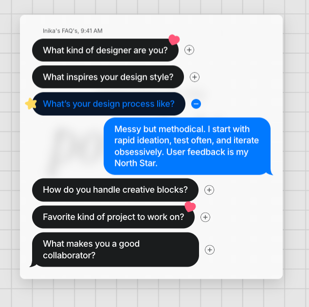
I really loved this little FAQ hidden in the message app
Most portfolios are forgettable. This one is not. It gives Inika a distinct identity before you even look at her work, which is exactly what a concept-driven portfolio should do.
A thoughtful and playful way of packaging projects
The folder-based structure for each project — complete with a TL;DR file, a link to the Figma case study, and sometimes an external project link or video — is smartly executed. It fits the macOS metaphor perfectly and maintains immersion without sacrificing clarity.

This in essence I really loved. It really felt like opening a project folder you used to have on your own computer
Even outside the project folders, the system is filled with small delights:
A chat-style “FAQ about me” window
A working Finder-style navigation pane
Little micro-interactions sprinkled throughout
These are the kinds of touches that suggest both intention and craft discipline — a designer who can execute holistically, not just assemble screens.
And importantly: the work inside the projects is good. Solid structure, thoughtful problem breakdowns, and a clear ability to design polished interfaces. For someone still in graduate school, the foundation is strong.
The Potential
Transition the actual work into the portfolio
This is the single largest issue holding the portfolio back.
Right now, all case studies open in Figma prototypes, and one of them (Simplingo) doesn’t open at all. This creates multiple problems:
It breaks the flow and pulls the viewer out of the experience
Figma loads slowly, especially for heavy files or weak Wi-Fi
Many recruiters will simply not click Figma links — at all
You cannot integrate motion, scroll-based storytelling, or transitions that match your macOS theme (at least not as well)

:(
And the biggest one:
You already proved you can build an immersive environment in Framer — why send the viewer somewhere worse?
This portfolio would instantly level up if the case studies were native pages or windows inside the same macOS metaphor:
A “Pages” app that opens the case study
A browser window that loads a custom-built case study template
A faux desktop document that expands into a full narrative
A modal window styled like a macOS preview pane
Even an initial transition step — embedding the Figma prototype inside a Framer page — would be an improvement. But long-term, this portfolio deserves custom case studies that match the incredible surface she has already built.
The work is strong enough to stand on its own. Give it the environment it deserves.
The macOS concept has a lot of promise but needs refinement and reduction
The surface is fantastic, but not everything inside it is functional — and that weakens the illusion.
The dock contains many icons that do nothing.
The Finder sidebar includes items that aren’t hooked up.
The trash can behaves inconsistently depending on where you click it.
Some labels (like “section header”) are placeholders that never got replaced.
Some elements look interactive but aren’t, which creates friction.
None of these are major on their own, but together they introduce noise into an otherwise polished metaphor.

Only two of these actually do something and only one of them has the proper hover state — definitely some potential for cleaning up
The solution isn’t to build more features — it’s to remove anything that does not serve the portfolio.
A streamlined version might include:
Only dock icons that actually open something
Clickable project folders placed more centrally for immediate visibility
A cleaned-up Finder with only functional sections
Preview thumbnails for each project folder (huge clarity boost)
Removal of any duplicate navigation paths
She’s 80–90% of the way to something truly exceptional. The last 10–20% is clarity, consistency, and polish — and will make a disproportionate impact.
The Verdict
Inika’s portfolio is one of the most creatively compelling surfaces I’ve seen from a graduate student in a long time. It’s bold, it’s fun, it’s expressive, and it shows a designer who already understands interaction, storytelling, and identity far better than many early-career peers.
The risk, of course, is that the surface outperforms the substance. And right now, the Figma-based case studies and a few rough edges in the macOS metaphor make the underlying work harder to access than it needs to be.
The good news: everything she needs to fix this is already within her skill set.
The foundation is strong. The craft is there. The point of view is unmistakable.
If she brings her case studies into Framer and streamlines the macOS interaction model, this becomes a portfolio that not only gets remembered — but gets her hired in environments that value creativity, product thinking, and interaction craft at a high level.
In short: the spark is absolutely there. The next iteration will turn it into fire.
Inika used Framer — the only other way to pull this off is (vibe)coding it.
Still struggling to get your portfolio off the ground?
Don’t want to spend weeks learning yet another tool? Framer is my top recommendation for building your portfolio — fast, clean, and without the usual headaches.
This portfolio will have you go “how did she do this?” a couple of times but the answer lies in the tool. With Framer a portfolio like Inika’s is possible. Otherwise you will likely have to resort to (vibe)coding something like this.
If you’re just starting out (or even if you’re not), I think Framer is a perfect fit. Here’s why:
Flat learning curve: The interface feels familiar if you’ve used Figma — plus, there’s a plugin to bring your designs straight in.
Plenty of learning support: Framer Academy is packed with free tutorials, videos, and guides to help you go from zero to published.
A huge template library: Tons of high-quality (often free) templates in the marketplace to help you launch quickly without starting from scratch.
And that’s just scratching the surface. I wrote more about why I recommend Framer here—but honestly, the best way is to try it for yourself.
Affiliate disclaimer: I only recommend tools I personally believe in. Some links in this post are affiliate links, which means I may earn a small commission if you choose to purchase — at no extra cost to you.
How I can help YOU
Do you want your own portfolio reviewed in-depth with a 30-minute advice-packed video review? Or do you require mentoring to figure out a proper strategy for your job search?
I got you!
Book a mentoring session with me
Book a quick 15 min chat to ask a question and see if we vibe
Florian BoelterFlorian Boelter is a product designer, mentor and builder focussed on helping early-career designers navigate the job search and the first steps on the job. If my content helps you in any way I’d appreciate you sharing it on social media or forwarding it to your friends directly! |
