- Open Doors
- Posts
- Junior Portfolio Showcase: Brian Yang
Junior Portfolio Showcase: Brian Yang
Elegant, restrained, and already effective — with the foundations for a standout career.

Today: Brian Yang
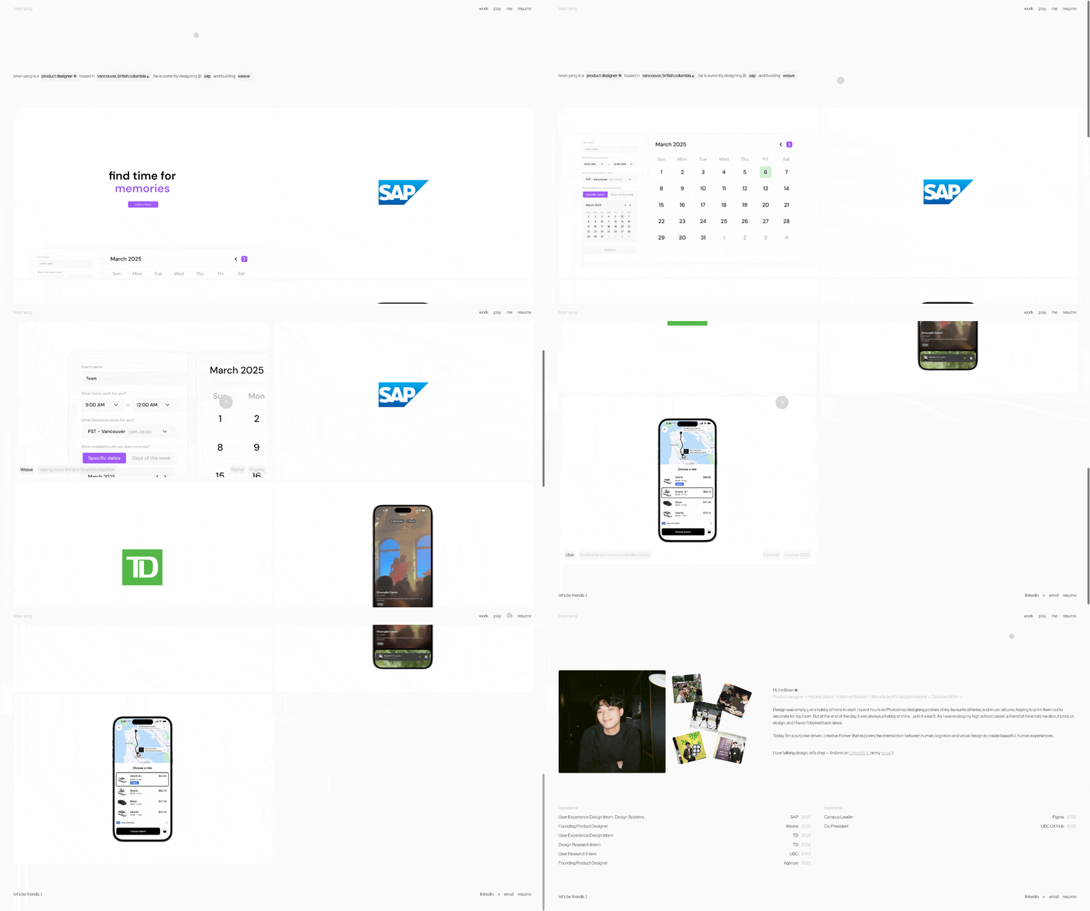
Brian Yang is a product designer based in Vancouver and currently studying HCI at the University of British Columbia. He’s still a student, but already brings experience from internships at TD Bank and SAP, alongside a self-initiated startup project, Weave, that’s actively used within his university context.
What makes Brian interesting right away is the range he shows: he can operate inside highly constrained, enterprise environments, but also switch gears and work in a scrappy, zero-to-one setup. That kind of versatility is not common at this stage—and it shows throughout his portfolio.
This is a portfolio that doesn’t try to impress through excess. It’s quiet, confident, and deliberate. And while there are a couple of areas where Brian could level this up further, the foundation here is very strong.
The Good
1. Restraint, clarity, and strong fundamentals
The first thing that stands out is how simple Brian’s portfolio is—and how well that simplicity is executed.
From the homepage through to the case studies, everything feels intentional. There’s no visual noise, no unnecessary color, no decorative elements trying to compensate for weak content. Instead, Brian relies on a tight grayscale palette, solid typography, and generous spacing. This immediately signals that he understands design fundamentals and trusts them.

As simple as it gets in terms of color and typography BUT everything is done right - which is rare
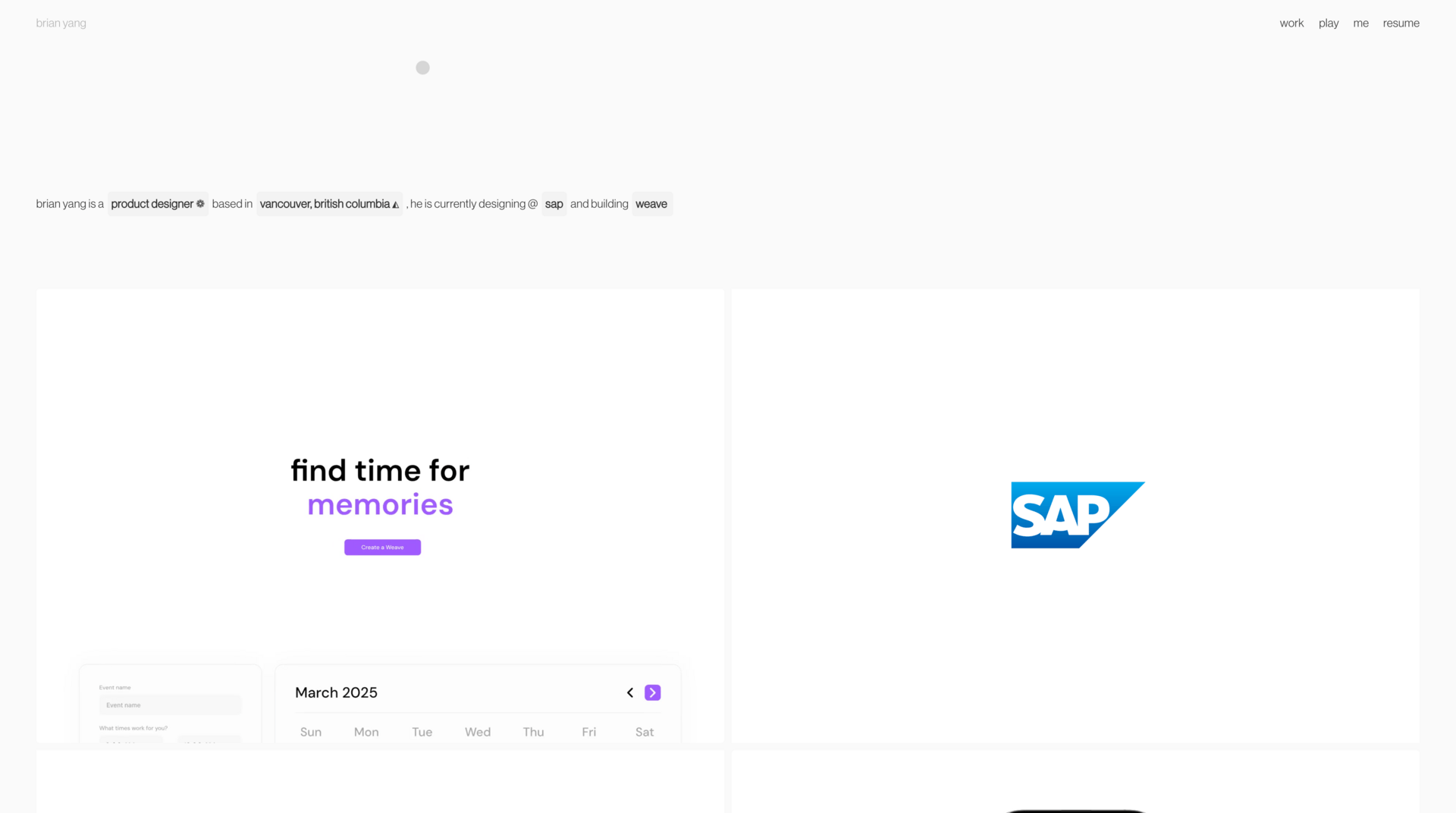
That restraint extends to interaction design. The subtle Easter eggs in his intro—where clicking on certain words reveals small bits of context—are a great example. They’re not loud, they’re not central to the experience, but they reward curiosity. You could easily miss them, and that’s fine. If you do notice them, they add personality without undermining the clarity of the page.
His project grid works similarly. The work is visual-first, with information revealed on hover. In some cases, the previews are animated loops of the actual product, which is particularly effective. It makes the work feel alive and immediately gives you a sense of what the product does, without forcing you into a case study yet.
Overall, this portfolio proves a point that many juniors miss: you don’t need elaborate visuals to look polished. You need strong fundamentals, good judgment, and consistency. Brian clearly has all three.
2. Visual-first storytelling that respects attention
Brian’s case studies are a good example of modern, recruiter-friendly storytelling.
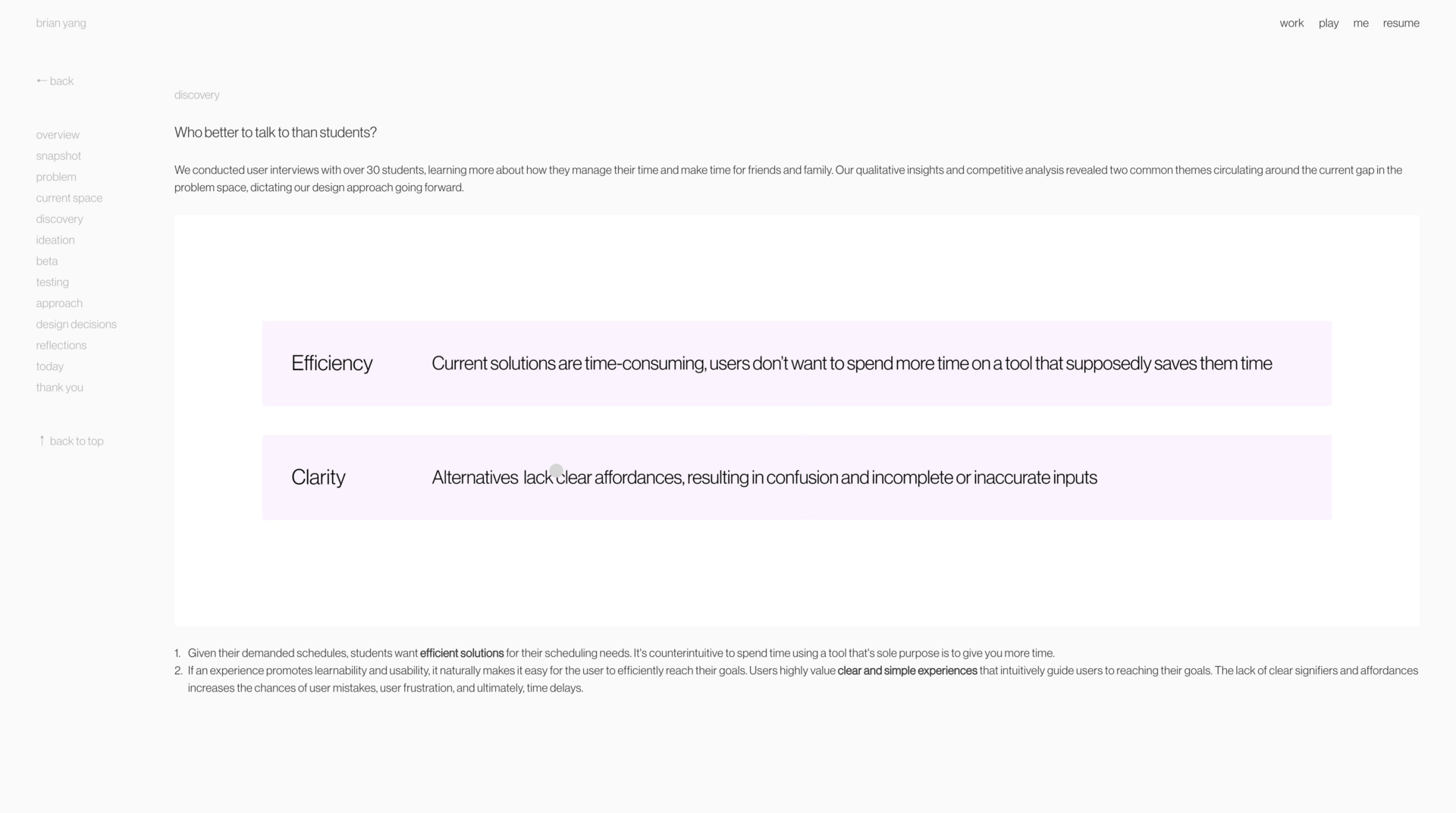
He avoids long walls of text and instead lets visuals do most of the heavy lifting. Short video loops replace large screen dumps, which makes the work easier to understand and far more engaging. You stop scrolling because something is moving—not because you’re being asked to read a paragraph.

Visual elements taking the leads, text following and headings doing the rest of the job
When text does appear, it’s concise and personal. Brian consistently speaks from his own perspective, clearly explaining what he did, why certain decisions were made, and how his work fit into the broader effort. That’s not something to take for granted—many early-career designers hide behind “we” and never fully articulate their individual contribution.
The result is case studies that are highly scannable, easy to digest, and respectful of limited attention spans. Even the longest ones don’t feel heavy. In environments where hiring managers might only spend a few minutes per portfolio, this is a real strength.
The Potential
1. Impact and outcomes are underplayed
The biggest opportunity in Brian’s portfolio is impact.
Right now, most projects stop at what was designed and how it was designed. What’s missing is a clearer connection to what changed because of that work—especially where Brian has the freedom to talk about it.
Some constraints are understandable. The TD Bank project is almost certainly bound by NDA limitations, and that’s fine. Still, it would help to explicitly say so. A short disclaimer explaining why details are limited removes ambiguity and shows professional awareness.
Where the real opportunity lies is Weave.
This is a live product with real users, and Brian does mention adoption—300 monthly active users—but it’s buried in a sentence and visually understated. This should be a highlight. Not just the number itself, but what it represents: traction, validation, and sustained use.
Beyond that, there’s likely more Brian could surface:
How is Weave used in practice?
What behavior changed because it exists?
Did it unlock attention, funding, institutional support, or expansion?
None of this needs to be over-quantified. This isn’t about vanity metrics. It’s about showing awareness that design creates outcomes beyond the interface—and that Brian is thinking about those outcomes.
Bridging craft and business thinking is what differentiates strong juniors from standout ones. Brian is already halfway there.
2. Concept work placement and portfolio structure
The second opportunity is about composition and expectation management.
On the homepage, Brian presents five projects together:
Weave
SAP
TD Bank
Spotify (concept)
Uber (concept)
The issue isn’t quality—the conceptual work is well-crafted—but placement. These concepts aren’t full case studies, yet they live alongside projects that are. Even with the “concept” tag, this creates a mismatch between expectation and payoff, especially for recruiters who skim quickly.

*sad noises*
Brian already has enough strong, real-world work to carry the portfolio. The concepts don’t need to compete for attention on the homepage.
The solution is straightforward:
This reduces friction, avoids disappointment, and sharpens the narrative of the portfolio. If Brian wants to guide people toward that work, a simple link beneath the main projects (“More conceptual explorations →”) would do the job without disrupting the flow.
As a final, smaller note: once those concepts are moved, upgrading the cover visuals for SAP and TD (instead of relying on logos) would strengthen the homepage even further.
The Verdict
Brian Yang has a very strong early-career portfolio.
His restraint, visual judgment, and ability to tell clear, modern case studies already put him ahead of most students. He understands how to design for real constraints, how to show work without over-explaining, and how to let the product speak.
The next step isn’t more polish—it’s context. Adding clearer signals around impact and tightening the structure of what’s shown where would elevate this portfolio from “very good” to genuinely compelling at the next level.
Brian is clearly on the right trajectory. With a bit more emphasis on outcomes and positioning, this portfolio won’t just open doors—it will give him more control over which doors open.
Students like Brian get Framer Pro for free— yes really!
Still struggling to get your portfolio off the ground?
Don’t want to spend weeks learning yet another tool? Framer is my top recommendation for building your portfolio — fast, clean, and without the usual headaches.
If you’re just starting out (or even if you’re not), I think Framer is a perfect fit. Here’s why:
Flat learning curve: The interface feels familiar if you’ve used Figma — plus, there’s a plugin to bring your designs straight in.
Plenty of learning support: Framer Academy is packed with free tutorials, videos, and guides to help you go from zero to published.
A huge template library: Tons of high-quality (often free) templates in the marketplace to help you launch quickly without starting from scratch.
Free if you are a student: Although Framer already offers a generous free plan for everyone, if you are an enrolled student you can get Framer Pro completely for free!
And that’s just scratching the surface. I wrote more about why I recommend Framer here—but honestly, the best way is to try it for yourself.
Affiliate disclaimer: I only recommend tools I personally believe in. Some links in this post are affiliate links, which means I may earn a small commission if you choose to purchase — at no extra cost to you.
How I can help YOU
Do you want your own portfolio reviewed in-depth with a 30-minute advice-packed video review? Or do you require mentoring to figure out a proper strategy for your job search?
I got you!
Book a mentoring session with me
Book a quick 15 min chat to ask a question and see if we vibe
Florian BoelterFlorian Boelter is a product designer, mentor and builder focussed on helping early-career designers navigate the job search and the first steps on the job. If my content helps you in any way I’d appreciate you sharing it on social media or forwarding it to your friends directly! |
