- Open Doors
- Posts
- Junior Portfolio Showcase: Andrea Da Silva
Junior Portfolio Showcase: Andrea Da Silva
A standout early-career portfolio defined by taste, craft, and personality.

Today: Andrea Da Silva
Andrea Da Silva’s portfolio is one of those rare early-career surfaces that immediately feels different — crafted, alive, and unmistakably personal from the first interaction.
Shared recently by Ridd — one of the sharpest eyes and clearest tastemakers in the design community — Andrea’s work comes with a level of endorsement that is almost unheard of for a junior designer. Ritt doesn’t typically surface early-career portfolios at all, so when he called this one out, it was clear there was something worth paying attention to. And he was right. Andrea’s site shows a designer who understands craft far beyond her years, blending personality, motion, and intention into a cohesive product that genuinely stands out.
What makes her portfolio particularly compelling is how considered it feels. Every hover state, every transition, every illustration, every moment of motion has a purpose. Andrea brings a deeply personal tone to her surface, yet anchors it in a high bar of visual and interaction design that never drifts into excess. This is a bespoke portfolio — not a template, not a patchwork, but a product with a point of view.
For anyone wondering what it looks like when a junior designer leverages personality, taste, and craft to create a uniquely memorable presence, Andrea’s portfolio is one of the best recent examples. Let’s take a closer look at what makes it exceptional — and where some refinement can push it even further.
The Good
Exceptional interaction design and motion craft
Andrea’s portfolio doesn’t just look good — it feels good. The interaction design is some of the strongest I’ve seen at a junior level, and it sets the tone from the very first second.
Her hero section is a masterclass in subtle but high-impact interaction. Every hover feels smooth and intentional, every micro-transition is tuned with care, and each element contributes to a cohesive emotional experience.
A standout moment: the resume interaction. Instead of a static button, she anchors the entry point with the Amazon logo — a highly strategic decision, given that recruiters often skim before they engage. Hovering reveals additional well-known brands (BMW, Figma, Mayo Clinic), executed through a tasteful animation that immediately positions Andrea as someone with meaningful experience. Clicking opens an interactive, lightweight resume page with photos and expandable context, creating a delightful alternative to the usual PDF graveyard.

The resume button is such an underutilized element but Andrea leveraged its full potential
This level of interactive thinking continues through the project cards, which tilt and reveal curated screens and contextual notes. None of it feels decorative for the sake of it. Instead, it’s used as an intentional conversion lever — making you want to click into her work because the surface is so polished and cohesive.
For a junior designer, this is rare. Andrea understands both interaction patterns and the emotional effect of motion. She uses Framer to amplify her storytelling without overwhelming it — and that balance is what makes this portfolio feel so bespoke.
Visual storytelling and curation at a remarkably high level
Andrea’s visual storytelling in the Cheers case study is not just strong — it’s mature. She avoids the pitfalls nearly every early-career designer falls into and instead chooses clarity, restraint, and smart visual communication.
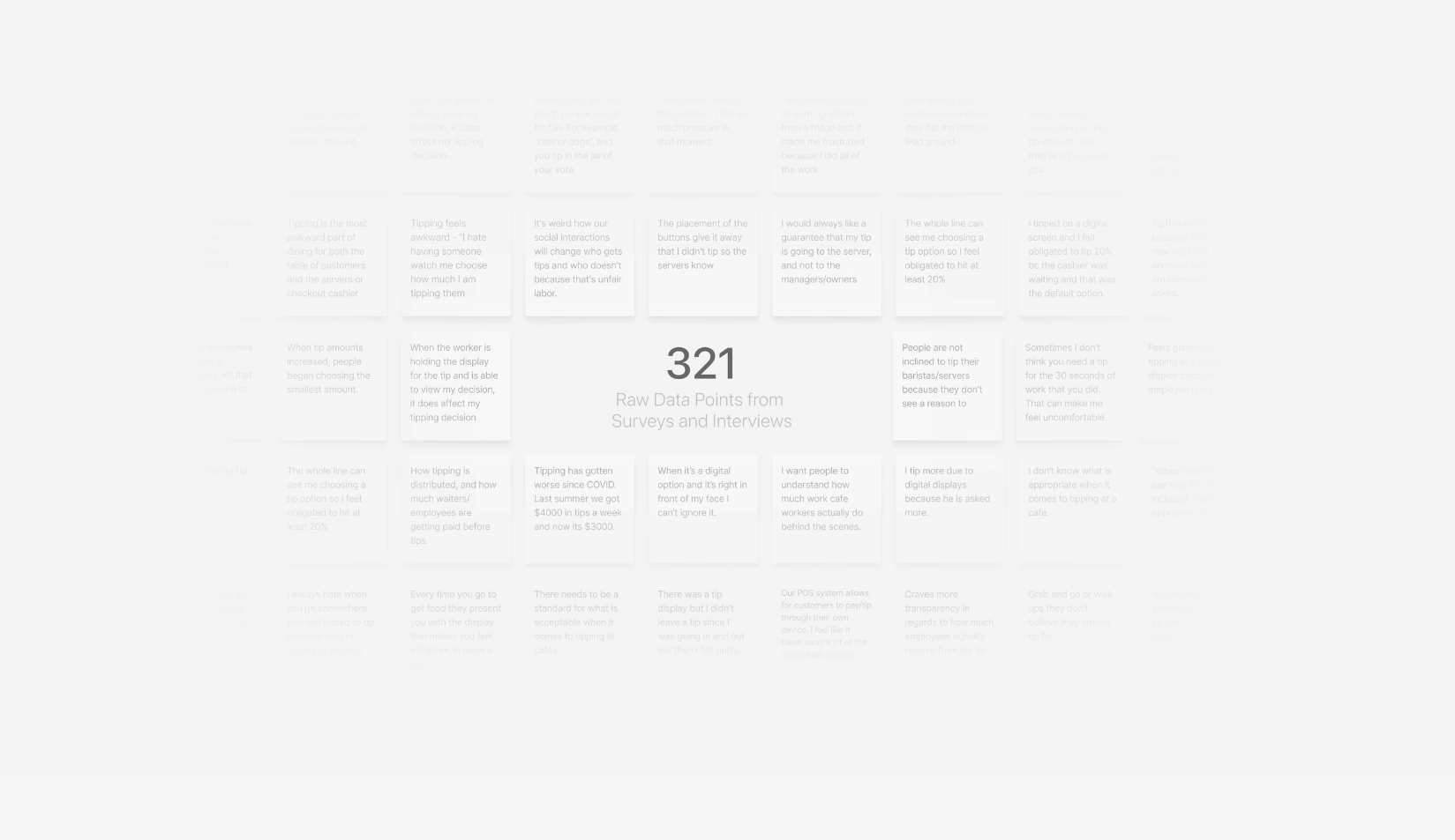
Her research section is a perfect example. Instead of dumping unreadable FigJam boards or presenting endless text, she reduces everything to a clean single insight and then visual hints.
She shows blurred/faded sticky notes with a clear count (“321 raw data points”) to communicate scale without overwhelming the reader. It reinforces credibility without resorting to traditional, bloated research artefacts.

This is SO much better than a bland FigJam screenshot of your 500 stickies
Her text is consistently tight. Nothing runs long. No paragraph overstays its welcome. Five lines is the absolute maximum.
Headings do real work. They communicate outcomes, not categories.
The entire case study is held together by a cohesive visual system: tailored illustrations, tasteful motion samples, and a bento-style grid summarizing core design concepts. It feels crafted — not assembled.
None of this is heavy-handed or reliant on “making it pretty.” It’s functional storytelling executed with taste. It’s what happens when someone understands why visual storytelling matters instead of merely applying surface-level polish.
The Potential
Several featured projects are not accessible
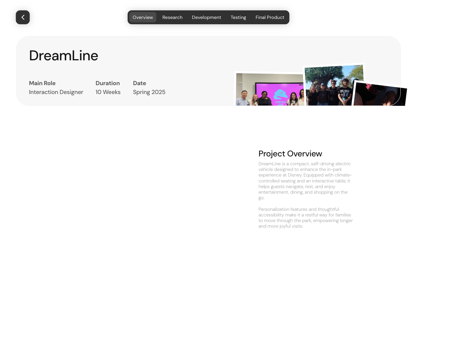
Andrea’s strongest case study (Cheers) is finished and excellent. The issue lies with the other two projects featured prominently on the homepage. Both look compelling, but clicking them leads nowhere — the links are broken or land on unfinished pages.

That’s all I get after hunting the case study down via her full grid of work ☹️
This creates an unintended form of friction:
Recruiters click the first card; nothing happens.
They click the second card; same result.
They only reach Cheers if they happen to choose this one to look at, leaving them with a high chance of a disappointment first when they try to go for any of the others.
Andrea does earn a degree of forgiveness because the portfolio’s overall interaction quality is so strong. Recruiters will continue scrolling. But this is still a risk — many will simply bounce.
If the case studies aren’t ready yet, the next-best pattern is:
Add a visible “Coming soon” label.
Keep only the accessible project(s) in the featured area.
Optionally surface the Nest thermostat redesign, which is accessible and strong enough to show.
The rule is simple:
If it’s not done, it shouldn’t look like it’s done — or be there at all yet.
Andrea’s portfolio has already generated significant buzz — you should state this in the review. Recruiters are already reaching out, which is proof that even with broken links, the portfolio is strong enough to cut through. But this is still a fix worth making.
Remove junior artefacts (personas, journey maps, brand guides)
Andrea’s storytelling is strong, but there are a few sections in the case study where unnecessary junior artefacts sneak in — and they dilute the otherwise exceptional level of craft.
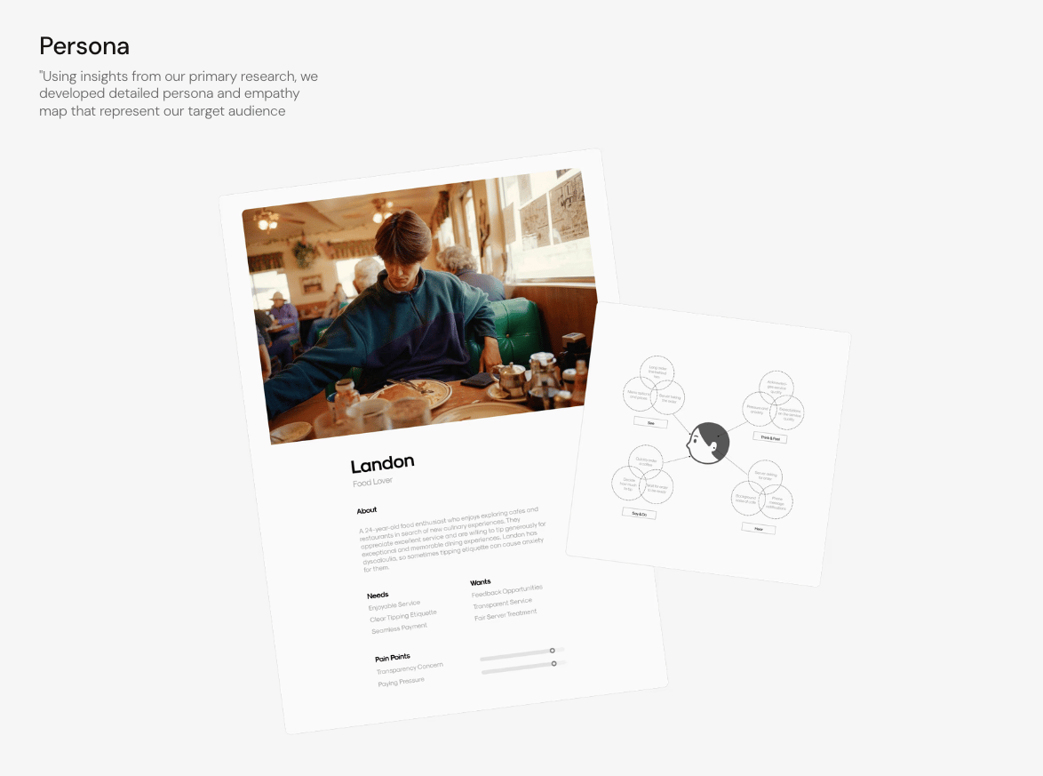
The persona section is the clearest example. Personas in junior projects rarely add meaningful clarity. In this case, the content is generic, the representation is hard to read, and the section doesn’t materially support the narrative. Cutting it entirely would make the case study feel more senior.

Not much wrong with it visually but can we please make it a new years resolution for 2026 to ban personas from case studies?
The journey map suffers from a similar issue. It’s clean, but not impactful. If it’s not meaningful enough to make interactive or more deeply integrated, it’s probably not meaningful enough to show at all. Summaries would do the work better.
The brand style guide elements (typography, color chips, etc.) feel unnecessary for someone who clearly demonstrates strong visual skills elsewhere. Andrea’s craft comes through in the portfolio itself — she doesn’t need to prove her typography instincts by laying out a grid of text styles. This is a Behance-era artefact worth leaving behind.
The broad recommendation:
Strip away anything that feels like “expected junior filler.”
Andrea’s work is strong enough that less will make her look more senior.
The Verdict
Andrea Da Silva’s portfolio is one of the most exciting junior surfaces I’ve seen in a long time — polished, emotionally rich, and unmistakably crafted by someone who understands product, motion, and visual storytelling at a deeper level than most emerging designers.
Her interaction patterns are stunning. Her case study thinking is sharp. Her visual language is deeply considered. It’s no wonder Ridd highlighted it publicly — and that alone should tell you how high the bar is here.
There is still some work to do: primarily fixing broken links on her homepage, trimming junior-level artefacts from the case study, and ensuring the experience feels complete across the board. But none of these issues undermine the core truth: Andrea is operating with a level of craft and taste that often takes years to develop.
If she finishes the remaining case studies and removes the unnecessary filler, this will become one of the strongest early-career portfolios in the market.
Keep an eye out — I would not be surprised if she announces a great new role very soon.
Andrea used Framer — and I’m anything but surprised.
Still struggling to get your portfolio off the ground?
Don’t want to spend weeks learning yet another tool? Framer is my top recommendation for building your portfolio — fast, clean, and without the usual headaches.
All these amazing interactions? A breeze to create them with Framer if you know what you are going for. This used to be SO cumbersome with other tools and even in code. Framer made this achievable without the technical rink-a-dink.
If you’re just starting out (or even if you’re not), I think Framer is a perfect fit. Here’s why:
Flat learning curve: The interface feels familiar if you’ve used Figma — plus, there’s a plugin to bring your designs straight in.
Plenty of learning support: Framer Academy is packed with free tutorials, videos, and guides to help you go from zero to published.
A huge template library: Tons of high-quality (often free) templates in the marketplace to help you launch quickly without starting from scratch.
And that’s just scratching the surface. I wrote more about why I recommend Framer here—but honestly, the best way is to try it for yourself.
Affiliate disclaimer: I only recommend tools I personally believe in. Some links in this post are affiliate links, which means I may earn a small commission if you choose to purchase — at no extra cost to you.
How I can help YOU
Do you want your own portfolio reviewed in-depth with a 30-minute advice-packed video review? Or do you require mentoring to figure out a proper strategy for your job search?
I got you!
Book a mentoring session with me
Book a quick 15 min chat to ask a question and see if we vibe
Florian BoelterFlorian Boelter is a product designer, mentor and builder focussed on helping early-career designers navigate the job search and the first steps on the job. If my content helps you in any way I’d appreciate you sharing it on social media or forwarding it to your friends directly! |
